Ever since Liam Neeson became an action hero thanks to Taken back in 2008, the Irish ace has appeared in banger after banger, delivering high-octane hits and critically acclaimed crowd-pleasers. From The Grey and Widows to The Ballad of Buster Scruggs and In the Land of Saints and Sinners, there’s been no movie off limits for Neeson. That includes a 2014 action thriller gem that’s officially being cut from streaming this week.
Liam Neeson Leads an “Unpredictable” Action Thriller
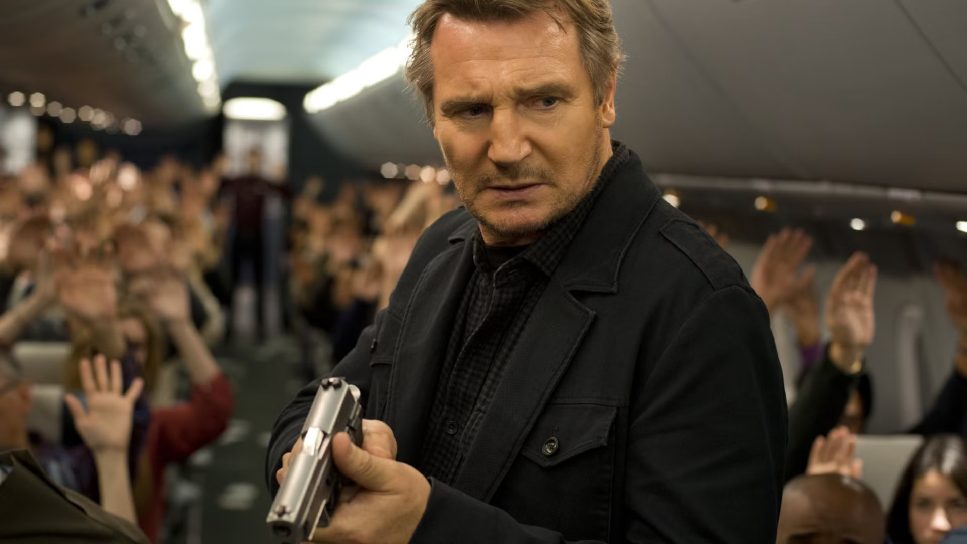
Directed by Jaume Collet-Serra (Netflix’s Carry-On), Non-Stop stars Neeson as Bill Marks, an air marshal caught in a deadly mystery aboard a transatlantic flight. Struggling with personal demons, a routine assignment turns into a ticking-clock situation when an anonymous caller on board threatens to kill a passenger every 20 minutes until the government transfers $150 million into an offshore account.
/* Streaming Top 10 vignette. All rules are scoped under .st10.
One card with two faces (Movies, TV) that flips in 3D. Movies follows the
reader’s light/dark setting and TV is the opposite, so a flip always
changes the colour scheme. Neutrals are sampled from movieweb.com; the
open streamer’s brand colour (adapted for contrast) drives the frame,
active tab, highlight, change arrows and NEW badge. */
.st10 {
–st10-heading-font: ‘Poppins’, Arial, Helvetica, sans-serif;
–st10-body-font: ‘Roboto’, Arial, Helvetica, sans-serif;
/* Stat column widths */
–st10-w-change: 4.5rem;
–st10-w-days: 6.5rem;
–st10-w-rt: 3.75rem;
–st10-w-episodes: 5rem;
–st10-w-peak: 3.75rem;
–st10-w-runtime: 4.75rem;
–st10-w-weeks: 4.25rem;
/* Space between columns, carried by each cell’s left padding (a real
column gap would let scrolled cells show between the pinned columns) */
–st10-gap: 8px;
–st10-w-views: 4.75rem;
–st10-w-hours: 4.75rem;
box-sizing: border-box;
max-width: 760px;
margin: 24px auto;
font-family: var(–st10-body-font);
font-size: 15px;
line-height: 1.4;
container: st10 / inline-size;
}
.st10 *,
.st10 *::before,
.st10 *::after { box-sizing: inherit; }
/* CMS fields: never visible, whatever the host CSS does */
.st10 [data-st10-field] { display: none !important; }
.st10[hidden],
.st10 [hidden] { display: none !important; }
.st10 .st10__sr {
position: absolute !important;
width: 1px; height: 1px; margin: -1px; padding: 0;
overflow: hidden; clip: rect(0 0 0 0); white-space: nowrap; border: 0;
}
/* —- Static frame from the HTML block: shows until the script swaps in
the live chart (and in editors that don’t run scripts). Follows the
reader’s light/dark setting. —- */
.st10 .st10__shell {
–st10-panel: #ffffff; –st10-card: #f2f2f2; –st10-text: #181818; –st10-muted: #6b6b6b;
–st10-heading: #555555; –st10-rule: #e4e4e4; –st10-btn: #737373; –st10-btn-text: #ffffff;
–svc-ink: var(–svc-ink-l);
padding: 16px 16px 12px;
border: 1px solid var(–st10-rule);
border-color: color-mix(in srgb, var(–svc-fill) 55%, var(–st10-panel));
border-radius: 4px;
background: var(–st10-panel);
color: var(–st10-text);
}
@media (prefers-color-scheme: dark) {
.st10 .st10__shell {
–st10-panel: #181818; –st10-card: #333333; –st10-text: #ffffff; –st10-muted: #b0b0b0;
–st10-heading: #b0b0b0; –st10-rule: #2c2c2c; –svc-ink: var(–svc-ink-d);
}
}
/* A block can fix its theme with data-st10-theme=”light” or “dark” */
.st10[data-st10-theme=”dark”] .st10__shell {
–st10-panel: #181818; –st10-card: #333333; –st10-text: #ffffff; –st10-muted: #b0b0b0;
–st10-heading: #b0b0b0; –st10-rule: #2c2c2c; –svc-ink: var(–svc-ink-d);
}
.st10[data-st10-theme=”light”] .st10__shell {
–st10-panel: #ffffff; –st10-card: #f2f2f2; –st10-text: #181818; –st10-muted: #6b6b6b;
–st10-heading: #555555; –st10-rule: #e4e4e4; –svc-ink: var(–svc-ink-l);
}
.st10 .st10__shell .st10__flipbtn.is-on,
.st10 .st10__shell .st10__tab.is-on { background: var(–svc-fill); color: var(–svc-on); }
.st10 .st10__shell .st10__tab.is-on { box-shadow: 0 0 0 2px var(–st10-panel), 0 0 0 3px var(–svc-fill); }
.st10 .st10__shell .st10__flipbtn { cursor: default; }
.st10 .st10__skeleton { display: grid; }
/* Same height as the table’s column-header row, so nothing jumps when the chart arrives */
.st10 .st10__skeleton b { display: block; height: 27px; }
.st10 .st10__shell .st10__btn { cursor: default; }
.st10 .st10__skeleton i {
display: block;
height: 42px;
border-top: 1px solid var(–st10-rule);
background: linear-gradient(var(–st10-card), var(–st10-card)) 8px 50% / 55% 10px no-repeat;
opacity: 0.7;
}
/* Preview-only status line (why the widget couldn’t load) */
.st10 .st10__note {
margin: 8px 0 0;
padding: 12px 14px;
border: 1px dashed #737373;
border-radius: 4px;
background: #f2f2f2;
color: #181818;
font-size: 14px;
line-height: 1.4;
}
/* —- Themes (set per face) —- */
.st10 .st10__face.is-light {
–st10-panel: #ffffff;
–st10-card: #f2f2f2;
–st10-text: #181818;
–st10-muted: #6b6b6b;
–st10-heading: #555555;
–st10-rule: #e4e4e4;
–st10-btn: #737373;
–st10-btn-text: #ffffff;
–svc-ink: var(–svc-ink-l);
–st10-up: #0b5c2b;
–st10-down: #8f1218;
color-scheme: light;
}
.st10 .st10__face.is-dark {
–st10-panel: #181818;
–st10-card: #333333;
–st10-text: #ffffff;
–st10-muted: #b0b0b0;
–st10-heading: #b0b0b0;
–st10-rule: #2c2c2c;
–st10-btn: #737373;
–st10-btn-text: #ffffff;
–svc-ink: var(–svc-ink-d);
–st10-up: #4ade80;
–st10-down: #ffa3a3;
color-scheme: dark;
}
/* —- Streamer colours: fill, text on fill, ink for dark and light panels —- */
.st10 [data-svc] { –svc-fill: #de272e; –svc-on: #ffffff; –svc-ink-d: #ff5a5f; –svc-ink-l: #c81e25; }
.st10 [data-svc=”netflix”] { –svc-fill: #e50914; –svc-on: #ffffff; –svc-ink-d: #ff4a52; –svc-ink-l: #c20710; }
.st10 [data-svc=”prime”] { –svc-fill: #0f79d0; –svc-on: #ffffff; –svc-ink-d: #5cb6ff; –svc-ink-l: #0b6ab8; }
.st10 [data-svc=”max”] { –svc-fill: #5b2eff; –svc-on: #ffffff; –svc-ink-d: #a391ff; –svc-ink-l: #4a22e0; }
.st10 [data-svc=”disney”] { –svc-fill: #0e7c99; –svc-on: #ffffff; –svc-ink-d: #3fc1df; –svc-ink-l: #0b6f89; }
.st10 [data-svc=”paramount”] { –svc-fill: #0064ff; –svc-on: #ffffff; –svc-ink-d: #6ea3ff; –svc-ink-l: #0057dd; }
.st10 [data-svc=”hulu”] { –svc-fill: #1ce783; –svc-on: #05241a; –svc-ink-d: #1ce783; –svc-ink-l: #0a8a4b; }
.st10 [data-svc=”apple”] { –svc-ink-d: #e5e5ea; –svc-ink-l: #1d1d1f; }
.st10 .is-dark[data-svc=”apple”],
.st10 .is-dark [data-svc=”apple”] { –svc-fill: #f5f5f7; –svc-on: #111111; }
.st10 .is-light[data-svc=”apple”],
.st10 .is-light [data-svc=”apple”] { –svc-fill: #1d1d1f; –svc-on: #ffffff; }
/* —- The flipping card —- */
/* overflow-x: clip keeps a sideways-scrolling table inside a 3D card from
widening the page (Chrome lets it leak otherwise); vertical stays open */
.st10 .st10__card { perspective: 2000px; overflow-x: clip; }
.st10 .st10__spin {
position: relative;
transform-style: preserve-3d;
transition: transform 0.75s cubic-bezier(0.3, 0.7, 0.2, 1), height 0.35s ease;
}
.st10 .st10__spin.is-flipped { transform: rotateY(180deg); }
.st10 .st10__spin.no-anim { transition: none; }
.st10 .st10__face {
position: absolute;
top: 0;
left: 0;
right: 0;
padding: 16px 16px 12px;
border: 1px solid var(–st10-rule);
border-color: color-mix(in srgb, var(–svc-fill) 55%, var(–st10-panel));
border-radius: 4px;
background: var(–st10-panel);
color: var(–st10-text);
-webkit-backface-visibility: hidden;
backface-visibility: hidden;
transition: border-color 0.2s ease;
}
.st10 .st10__face + .st10__face { transform: rotateY(180deg); }
/* The side facing away, once the flip has finished: hidden outright, so no
browser can show any of it through the front */
.st10 .st10__face.is-away { visibility: hidden; }
@media (prefers-reduced-motion: reduce) {
.st10 .st10__spin { transition: none; }
}
.st10 button {
font: inherit;
color: inherit;
background: none;
border: 0;
margin: 0;
padding: 0;
cursor: pointer;
text-transform: none;
letter-spacing: normal;
}
/* Site link styles must not reach inside the widget (no double underlines) */
.st10 a,
.st10 a:hover,
.st10 a:visited {
border: 0 !important;
box-shadow: none !important;
background-image: none !important;
background-color: transparent !important;
}
.st10 a::before,
.st10 a::after { content: none !important; display: none !important; }
.st10 button:focus-visible,
.st10 a:focus-visible {
outline: 2px solid var(–svc-ink);
outline-offset: 2px;
}
/* —- Header: the site’s panel heading, with the Movies / TV switch —- */
.st10 .st10__head {
display: flex;
flex-wrap: wrap;
align-items: flex-start;
justify-content: space-between;
gap: 10px 16px;
margin: 0 0 12px;
}
.st10 .st10__titles { min-width: 0; }
.st10 .st10__title {
margin: 0;
padding: 0;
border: 0;
font-family: var(–st10-heading-font);
font-size: 20px;
font-weight: 600;
line-height: 1.2;
text-transform: uppercase;
color: var(–st10-heading);
}
.st10 .st10__date {
margin: 4px 0 0;
font-size: 13px;
color: var(–st10-muted);
}
.st10 .st10__flip {
display: inline-flex;
flex: none;
padding: 2px;
border-radius: 3px;
background: var(–st10-card);
}
.st10 .st10__flipbtn {
padding: 6px 12px;
border-radius: 2px;
color: var(–st10-muted);
font-family: var(–st10-heading-font);
font-size: 11px;
font-weight: 600;
line-height: 1.2;
text-transform: uppercase;
}
.st10 .st10__flipbtn:hover { color: var(–st10-text); }
.st10 .st10__flipbtn[aria-pressed=”true”] { background: var(–svc-fill); color: var(–svc-on); }
/* —- Service tabs: the site’s filter buttons, filled with the brand when open —- */
.st10 .st10__tabs {
display: flex;
flex-wrap: wrap;
gap: 6px;
margin: 0 0 12px;
}
.st10 .st10__tab,
.st10 .st10__btn {
display: inline-flex;
align-items: center;
gap: 5px;
padding: 6px 9px;
border-radius: 2px;
background: var(–st10-btn);
color: var(–st10-btn-text);
font-family: var(–st10-heading-font);
font-size: 11px;
font-weight: 600;
line-height: 1.2;
text-transform: uppercase;
white-space: nowrap;
}
.st10 .st10__tab:hover,
.st10 .st10__btn:hover { filter: brightness(1.12); }
.st10 .st10__btn–quiet {
background: transparent;
color: var(–st10-muted);
box-shadow: inset 0 0 0 1px var(–st10-rule);
}
.st10 .st10__btn–quiet:hover { color: var(–st10-text); filter: none; }
/* Tab layout by the widget’s width, for the static frame and the live card
alike: one row from 576px; below that even rows of equal buttons, at most
4 a row (the script sets –st10-tabcols from the tab count: 7 -> 4 + 3);
below 440px, where 4 no longer fit, one row that swipes sideways, never
uneven rows like 3 + 3 + 1. The 3px padding keeps the open tab’s ring
visible; the scrollbar is hidden (swipe, or arrow keys). */
@container st10 (max-width: 575.98px) {
.st10 .st10__tabs { display: grid; grid-template-columns: repeat(var(–st10-tabcols, 4), minmax(0, 1fr)); }
.st10 .st10__tabs .st10__tab { justify-content: center; }
}
@container st10 (max-width: 439.98px) {
.st10 .st10__tabs {
display: flex;
flex-wrap: nowrap;
overflow-x: auto;
padding: 3px;
margin-left: -3px;
margin-right: -3px;
scrollbar-width: none;
-webkit-overflow-scrolling: touch;
}
.st10 .st10__tabs::-webkit-scrollbar { display: none; }
.st10 .st10__tabs .st10__tab { flex: none; }
}
.st10 .st10__tab.is-on {
background: var(–svc-fill);
color: var(–svc-on);
box-shadow: 0 0 0 2px var(–st10-panel), 0 0 0 3px var(–svc-fill);
}
/* Two-row picker (Netflix). The top row is the main choice: solid fill when
selected, without the ring, so two rows don’t stack two heavy buttons.
The second row (language, or countries in the grouped layout) is quieter:
outlined buttons, the selected one in the accent’s outline and text. */
.st10 .st10__tabs–region { margin-bottom: 6px; }
.st10 .st10__tabs–region:last-child { margin-bottom: 12px; }
/* Prime has one row only: the loading frame keeps the same gap below it */
.st10[data-st10-variant=”prime”] .st10__shell .st10__tabs–region { margin-bottom: 12px; }
.st10 .st10__tabs–lang,
.st10 .st10__tabs–country { margin-bottom: 12px; }
.st10 .st10__tabs–region .st10__tab.is-on,
.st10 .st10__shell .st10__tabs–region .st10__tab.is-on { box-shadow: none; }
.st10 .st10__tabs–lang .st10__tab,
.st10 .st10__tabs–country .st10__tab,
.st10 .st10__shell .st10__tabs–lang .st10__tab {
background: transparent;
color: var(–st10-muted);
box-shadow: inset 0 0 0 1px var(–st10-rule);
}
.st10 .st10__tabs–lang .st10__tab:hover,
.st10 .st10__tabs–country .st10__tab:hover { color: var(–st10-text); filter: none; }
.st10 .st10__tabs–lang .st10__tab.is-on,
.st10 .st10__tabs–country .st10__tab.is-on,
.st10 .st10__shell .st10__tabs–lang .st10__tab.is-on {
background: var(–svc-fill);
color: var(–svc-on);
box-shadow: none;
font-weight: 700;
}
/* The picker rows fill the card’s width with equal buttons: one row when
wide (–st10-count is the number of buttons), even rows of at most 4 when
narrower (–st10-tabcols). Short labels, so they wrap rather than swipe. */
.st10 .st10__tabs.st10__tabs–region,
.st10 .st10__tabs.st10__tabs–lang,
.st10 .st10__tabs.st10__tabs–country {
display: grid;
grid-template-columns: repeat(var(–st10-count, 3), minmax(0, 1fr));
gap: 4px;
overflow: visible;
padding: 0;
margin-left: 0;
margin-right: 0;
}
.st10 .st10__tabs–region .st10__tab,
.st10 .st10__tabs–lang .st10__tab,
.st10 .st10__tabs–country .st10__tab { justify-content: center; flex: initial; }
@container st10 (max-width: 575.98px) {
.st10 .st10__tabs.st10__tabs–region,
.st10 .st10__tabs.st10__tabs–lang,
.st10 .st10__tabs.st10__tabs–country { grid-template-columns: repeat(var(–st10-tabcols, 3), minmax(0, 1fr)); }
}
@container st10 (max-width: 439.98px) {
.st10 .st10__tabs–region .st10__tab,
.st10 .st10__tabs–lang .st10__tab,
.st10 .st10__tabs–country .st10__tab { padding-left: 4px; padding-right: 4px; }
}
.st10 .st10__tab[disabled] { opacity: 0.4; cursor: default; }
.st10 .st10__tab[disabled]:hover { filter: none; }
/* Marks a tab the article’s title is on */
.st10 .st10__dot {
width: 6px;
height: 6px;
border-radius: 50%;
background: currentColor;
}
/* —- Table: one CSS grid per row; –st10-grid is set per table —- */
.st10 .st10__scroll { overflow-x: auto; }
.st10 .st10__scroll:focus-visible { outline: 2px solid var(–svc-ink); outline-offset: 2px; }
.st10 .st10__table { font-variant-numeric: tabular-nums; }
.st10 .st10__row {
–st10-rowbg: var(–st10-panel);
display: grid;
/* The title never gets narrower than 11rem; past that the stats scroll
sideways, with rank and title pinned */
grid-template-columns: calc(2rem + var(–st10-gap)) minmax(calc(11rem + var(–st10-gap)), 1fr) var(–st10-grid);
align-items: center;
column-gap: 0;
min-height: 42px;
padding: 0 8px 0 0;
border-top: 1px solid var(–st10-rule);
background: var(–st10-rowbg);
}
.st10 .st10__row–head {
align-items: end;
min-height: 0;
padding-bottom: 6px;
border-top: 0;
}
.st10 .st10__th,
.st10 .st10__td { min-width: 0; text-align: center; padding-left: var(–st10-gap); }
.st10 .st10__table { min-width: calc(2rem + 11rem + 2 * var(–st10-gap) + var(–st10-stats, 0rem) + 8px); }
/* Rank and title stay put while the stats scroll sideways */
.st10 .st10__td–rank,
.st10 .st10__th–rank,
.st10 .st10__td–title,
.st10 .st10__th–title {
position: sticky;
z-index: 1;
align-self: stretch;
display: flex;
align-items: center;
background: var(–st10-rowbg);
/* Safari (and every iPhone browser) draws pinned cells on their own layer
and ignores the face’s backface-visibility for them, so the far side’s
titles showed through mirrored. Each pinned cell hides its own back. */
-webkit-backface-visibility: hidden;
backface-visibility: hidden;
}
.st10 .st10__row–head .st10__th–rank,
.st10 .st10__row–head .st10__th–title { align-items: flex-end; }
.st10 .st10__td–rank,
.st10 .st10__th–rank { left: 0; justify-content: center; }
.st10 .st10__td–title,
.st10 .st10__th–title { left: calc(2rem + var(–st10-gap)); padding-right: 6px; }
.st10 .st10__scroll.is-scrolled .st10__td–title,
.st10 .st10__scroll.is-scrolled .st10__th–title { box-shadow: 6px 0 6px -6px rgba(0, 0, 0, 0.35); }
.st10 .st10__th–title,
.st10 .st10__td–title { text-align: left; }
.st10 .st10__sort {
display: inline-flex;
align-items: flex-end;
justify-content: center;
gap: 2px;
max-width: 100%;
padding: 2px;
color: var(–st10-muted);
font-family: var(–st10-heading-font);
font-size: 11px;
font-weight: 600;
line-height: 1.2;
text-transform: uppercase;
text-align: inherit;
}
.st10 .st10__th–title .st10__sort { justify-content: flex-start; }
.st10 .st10__sort:hover { color: var(–st10-text); }
.st10 .st10__sort.is-on { color: var(–svc-ink); }
.st10 .st10__arrow { flex: none; min-width: 0.6em; }
.st10 .st10__td–rank {
font-family: var(–st10-heading-font);
font-size: 16px;
font-weight: 700;
color: var(–st10-muted);
}
/* Title: always one line, so every row is the same height */
.st10 .st10__td–title {
display: flex;
align-items: center;
gap: 5px;
}
.st10 .st10__name {
min-width: 0;
overflow: hidden;
text-overflow: ellipsis;
white-space: nowrap;
font-weight: 500;
color: inherit;
text-decoration: none;
}
.st10 a.st10__name {
text-decoration: underline;
text-decoration-color: color-mix(in srgb, var(–svc-ink) 45%, transparent);
text-underline-offset: 3px;
}
.st10 a.st10__name:hover { color: var(–svc-ink); text-decoration-color: currentColor; }
.st10 .st10__year {
flex: none;
color: var(–st10-muted);
font-size: 13px;
}
/* A TV season label gives way to the show’s name: it shrinks first */
.st10 .st10__name { flex: 0 1 auto; }
.st10 .st10__season {
flex: 0 4 auto;
min-width: 0;
overflow: hidden;
text-overflow: ellipsis;
white-space: nowrap;
color: var(–st10-muted);
font-size: 13px;
}
.st10 .st10__na { color: var(–st10-muted); }
.st10 .st10__chg { font-weight: 700; font-size: 13px; white-space: nowrap; }
/* Movement is green up, red down in every streamer colour (checked for
contrast on both panels and the highlighted row) */
.st10 .st10__chg–up { color: var(–st10-up); }
.st10 .st10__chg–down { color: var(–st10-down); }
.st10 .st10__chg–same { color: var(–st10-muted); }
.st10 .st10__chg–new {
padding: 2px 5px;
border-radius: 2px;
background: var(–svc-fill);
color: var(–svc-on);
font-family: var(–st10-heading-font);
font-size: 10px;
font-weight: 600;
letter-spacing: 0.02em;
}
/* Rows with a hub page: the whole row opens it */
.st10 .st10__row.is-link { cursor: pointer; }
.st10 .st10__row.is-link:hover {
–st10-rowbg: color-mix(in srgb, var(–st10-text) 7%, var(–st10-panel));
}
.st10 .st10__row.is-link:hover .st10__name { color: var(–svc-ink); text-decoration-color: currentColor; }
/* The article’s title: a brand-tinted row */
.st10 .st10__row.is-subject {
–st10-rowbg: color-mix(in srgb, var(–svc-fill) 16%, var(–st10-panel));
border-radius: 2px;
}
.st10 .st10__row.is-subject.is-link:hover {
–st10-rowbg: color-mix(in srgb, var(–svc-fill) 26%, var(–st10-panel));
}
.st10 .st10__row.is-subject .st10__td–rank { color: var(–svc-ink); }
.st10 .st10__row.is-subject .st10__name { font-weight: 700; }
.st10 .st10__row.is-subject + .st10__row { border-top-color: transparent; }
/* —- Toggle and footer —- */
.st10 .st10__controls {
display: flex;
flex-wrap: wrap;
gap: 6px;
margin: 12px 0 0;
}
.st10 .st10__foot {
margin: 10px 0 0;
font-size: 11px;
color: var(–st10-muted);
}
/* —- Narrow: every column stays; the table scrolls sideways with the
rank and title pinned —- */
@container st10 (max-width: 600px) {
.st10 .st10__card,
.st10 .st10__shell {
–st10-w-change: 3.2rem;
–st10-w-days: 4rem;
–st10-w-rt: 3rem;
–st10-w-episodes: 4.2rem;
–st10-w-peak: 3rem;
–st10-w-runtime: 4.2rem;
–st10-w-weeks: 3.6rem;
–st10-gap: 0px;
–st10-w-views: 4rem;
–st10-w-hours: 4rem;
}
.st10 .st10__face { padding: 14px 12px 10px; }
.st10 .st10__shell { padding: 14px 12px 10px; }
.st10 .st10__skeleton b { height: 31px; }
/* Netflix’s narrow headers are all one line (Change, Weeks, Views) */
.st10[data-st10-variant=”netflix”] .st10__skeleton b,
.st10[data-st10-variant=”prime”] .st10__skeleton b { height: 20px; }
.st10 .st10__title { font-size: 17px; }
/* The title takes whatever width the stats leave, down to 8.5rem; only
below that does the table scroll sideways */
.st10 .st10__table { width: 100%; min-width: calc(1.6rem + 8.5rem + var(–st10-stats, 0rem) + 4px); font-size: 14px; }
.st10 .st10__season { font-size: 12px; }
.st10 .st10__year { font-size: 12px; }
/* No column gap here: scrolled cells would show through it between the
pinned columns. Cells pad themselves instead. */
.st10 .st10__row {
grid-template-columns: 1.6rem minmax(8.5rem, 1fr) var(–st10-grid);
padding: 0 4px 0 0;
}
.st10 .st10__th,
.st10 .st10__td { padding-left: 4px; }
.st10 .st10__td–rank,
.st10 .st10__th–rank { box-shadow: -4px 0 0 var(–st10-rowbg); }
.st10 .st10__td–title,
.st10 .st10__th–title { left: 1.6rem; padding-right: 4px; }
.st10 .st10__td–rank { font-size: 15px; }
.st10 .st10__sort { font-size: 10px; }
}
Also starring Julianne Moore (Boogie Nights, Hannibal), Michelle Dockery (Downton Abbey), Scoot McNairy (Furious), and Lupita Nyong’o (The Odyssey, US), Non-Stop was a force to be reckoned with at the box office, grossing $223 million against a budget of $50 million. It marked the second collaboration between Neeson and Collet-Serra after Unknown in 2011, and the two enjoyed each other’s company so much that they made two more movies together: Run All Night and The Commuter.
While it didn’t win any awards, Non-Stop did garner praise from critics and audiences. The film holds a solid 62% on Rotten Tomatoes from pundits, and 63% from viewers. “Not only is Non-Stop a good film, it’s an entertaining one as well,” wrote critic Kelechi Ehenulo of Confessions From a Geek Mind. Damond Fudge of KCCI in Des Moines, IA adds: “If you’re looking for an action film that’s an enjoyable diversion, then Non-Stop will fit the bill.” Some audience members even went so far as to call Non-Stop “better than Taken.”
‘Non-Stop’ Is Being Removed From Streaming This Week
At the moment, Non-Stop is available to stream in the United States with a subscription to Starz. All that will change this week, though, as the film is slated to depart the platform very soon. Per Movie of the Night, Non-Stop is slated to be removed from streaming on Nov. 1, meaning that today, Oct. 31, is your last day to stream it.
So far, there’s been no word on where Non-Stop will stream next, which means it will be unavailable until it finds a new home. The only way to watch it will be through a digital rental or purchase, so it’s best to watch it ASAP before it disappears.
Next up for Neeson is another action thriller titled The Mongoose, which hit theaters today. Following that, he’ll star in the heist thriller titled 4 Kids Walk Into a Bank, which is an adaptation of the comic series written by Matthew Rosenberg. The film is currently in post-production so no release date has been set, but it is expected to drop at some point in 2027.