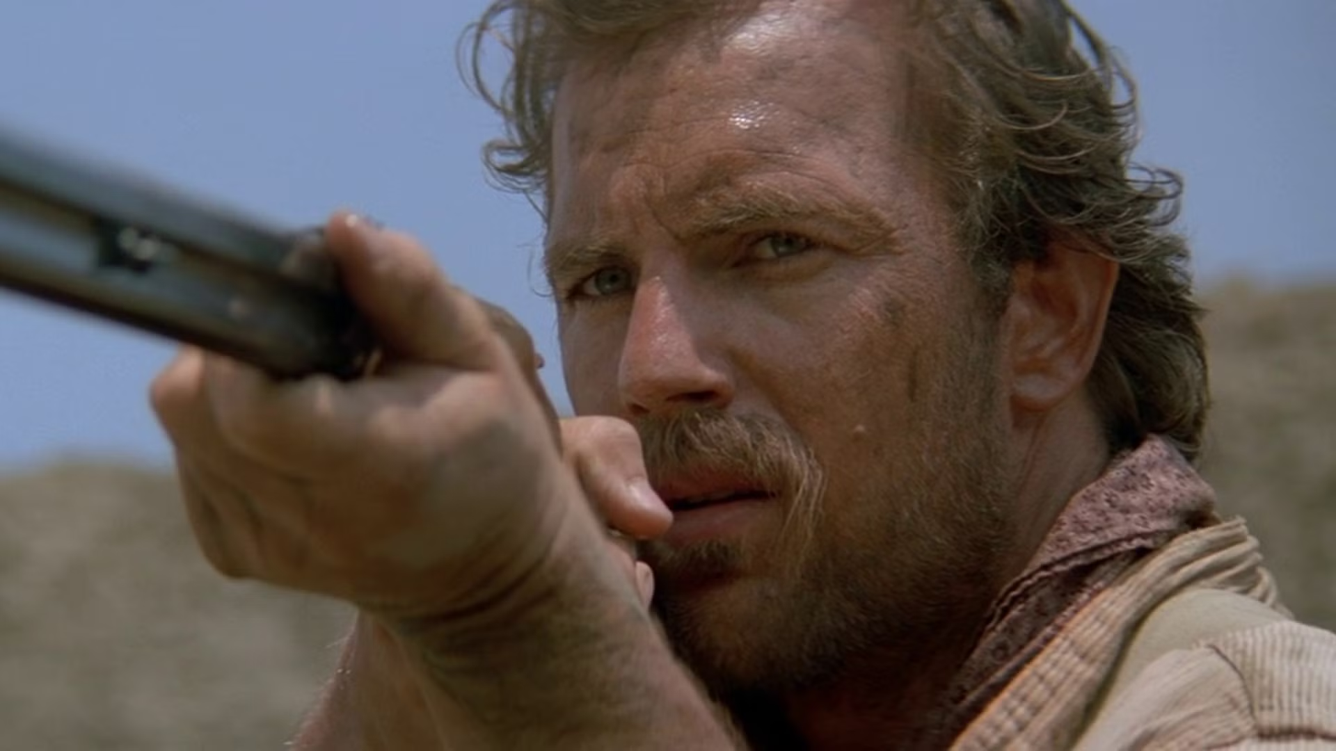
Despite the massive flop that was Horizon: An American Saga, there’s no denying Kevin Costner knows his way around a good Western. From Open Range to Yellowstone, the Hollywood icon has long been associated with the Old West. Now, 36 years after its premiere, one of his best is finding a new audience thanks to streaming.
Kevin Costner Pulls Double Duty in a Celebrated Western
-
 Orion Pictures
-
 Orion Pictures
-
 Orion Pictures
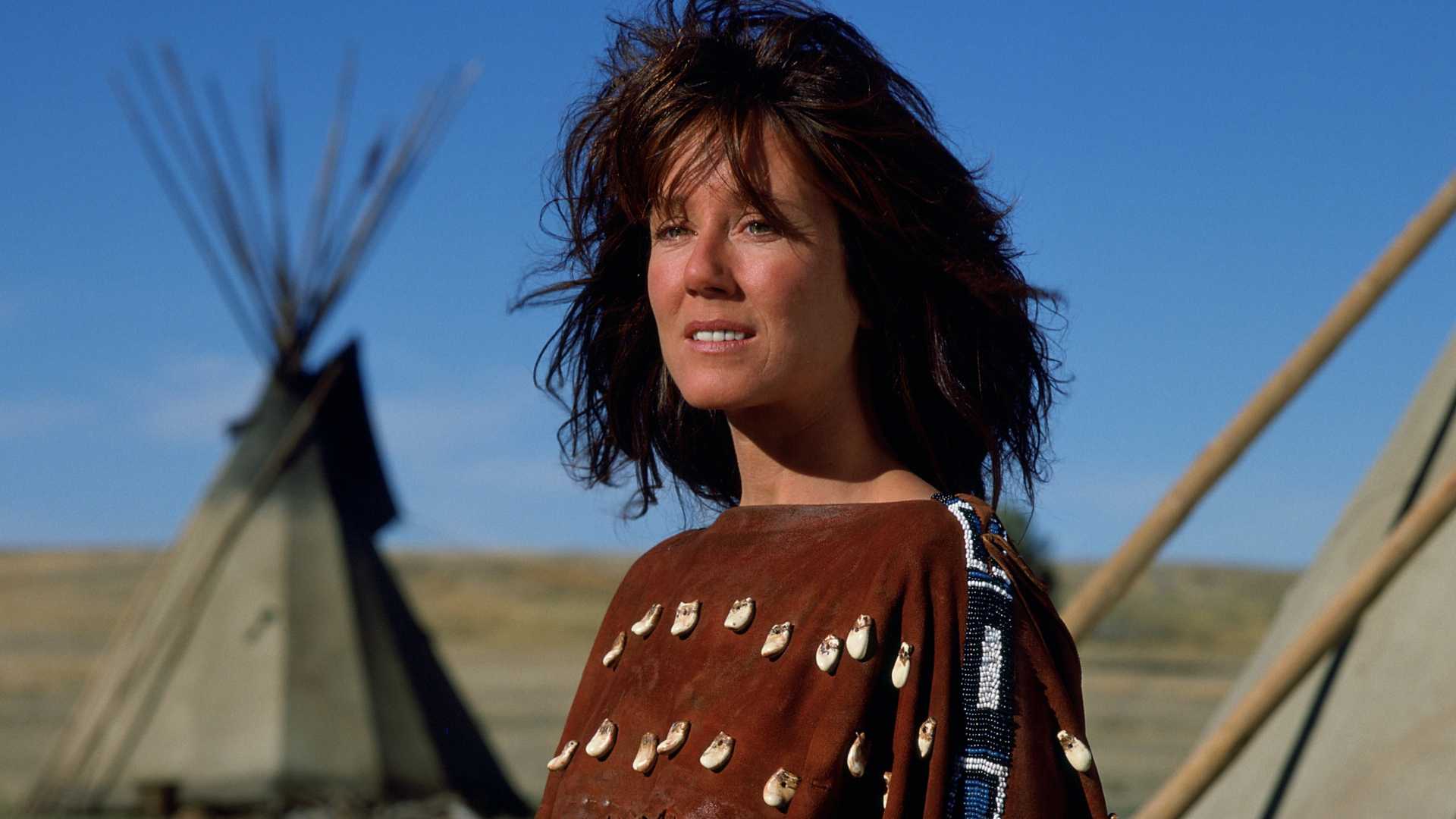
Hitting theaters on Nov. 9, 1990, Dances With Wolves was the first time Costner had stepped behind the camera to direct, and what a debut it was. Based on the 1988 novel of the same name by Michael Blake (who also penned the screenplay), the film became one of the most celebrated Westerns of all time thanks to its breathtaking cinematography and emotional storytelling.
Starring Costner as Lieutenant John Dunbar, Dances With Wolves is set during the Civil War and tells the story of a Union soldier who requests a transfer to a remote frontier outpost. Hoping to live his life in peaceful silence, he soon comes across members of a nearby Lakota Sioux community.
However, what begins as a tense relationship eventually develops into a meaningful friendship. It isn’t long before Dunbar becomes sympathetic to their way of life, which changes his understanding of things and causes him to question his loyalties.
/* Streaming Top 10 vignette. All rules are scoped under .st10.
One card with two faces (Movies, TV) that flips in 3D. Movies follows the
reader’s light/dark setting and TV is the opposite, so a flip always
changes the colour scheme. Neutrals are sampled from movieweb.com; the
open streamer’s brand colour (adapted for contrast) drives the frame,
active tab, highlight, change arrows and NEW badge. */
.st10 {
–st10-heading-font: ‘Poppins’, Arial, Helvetica, sans-serif;
–st10-body-font: ‘Roboto’, Arial, Helvetica, sans-serif;
/* Stat column widths */
–st10-w-change: 4.5rem;
–st10-w-days: 6.5rem;
–st10-w-rt: 3.75rem;
–st10-w-episodes: 5rem;
–st10-w-peak: 3.75rem;
–st10-w-runtime: 4.75rem;
–st10-w-weeks: 4.25rem;
/* Space between columns, carried by each cell’s left padding (a real
column gap would let scrolled cells show between the pinned columns) */
–st10-gap: 8px;
–st10-w-views: 4.75rem;
–st10-w-hours: 4.75rem;
box-sizing: border-box;
max-width: 760px;
margin: 24px auto;
font-family: var(–st10-body-font);
font-size: 15px;
line-height: 1.4;
container: st10 / inline-size;
}
.st10 *,
.st10 *::before,
.st10 *::after { box-sizing: inherit; }
/* CMS fields: never visible, whatever the host CSS does */
.st10 [data-st10-field] { display: none !important; }
.st10[hidden],
.st10 [hidden] { display: none !important; }
.st10 .st10__sr {
position: absolute !important;
width: 1px; height: 1px; margin: -1px; padding: 0;
overflow: hidden; clip: rect(0 0 0 0); white-space: nowrap; border: 0;
}
/* —- Static frame from the HTML block: shows until the script swaps in
the live chart (and in editors that don’t run scripts). Follows the
reader’s light/dark setting. —- */
.st10 .st10__shell {
–st10-panel: #ffffff; –st10-card: #f2f2f2; –st10-text: #181818; –st10-muted: #6b6b6b;
–st10-heading: #555555; –st10-rule: #e4e4e4; –st10-btn: #737373; –st10-btn-text: #ffffff;
–svc-ink: var(–svc-ink-l);
padding: 16px 16px 12px;
border: 1px solid var(–st10-rule);
border-color: color-mix(in srgb, var(–svc-fill) 55%, var(–st10-panel));
border-radius: 4px;
background: var(–st10-panel);
color: var(–st10-text);
}
@media (prefers-color-scheme: dark) {
.st10 .st10__shell {
–st10-panel: #181818; –st10-card: #333333; –st10-text: #ffffff; –st10-muted: #b0b0b0;
–st10-heading: #b0b0b0; –st10-rule: #2c2c2c; –svc-ink: var(–svc-ink-d);
}
}
/* A block can fix its theme with data-st10-theme=”light” or “dark” */
.st10[data-st10-theme=”dark”] .st10__shell {
–st10-panel: #181818; –st10-card: #333333; –st10-text: #ffffff; –st10-muted: #b0b0b0;
–st10-heading: #b0b0b0; –st10-rule: #2c2c2c; –svc-ink: var(–svc-ink-d);
}
.st10[data-st10-theme=”light”] .st10__shell {
–st10-panel: #ffffff; –st10-card: #f2f2f2; –st10-text: #181818; –st10-muted: #6b6b6b;
–st10-heading: #555555; –st10-rule: #e4e4e4; –svc-ink: var(–svc-ink-l);
}
.st10 .st10__shell .st10__flipbtn.is-on,
.st10 .st10__shell .st10__tab.is-on { background: var(–svc-fill); color: var(–svc-on); }
.st10 .st10__shell .st10__tab.is-on { box-shadow: 0 0 0 2px var(–st10-panel), 0 0 0 3px var(–svc-fill); }
.st10 .st10__shell .st10__flipbtn { cursor: default; }
.st10 .st10__skeleton { display: grid; }
/* Same height as the table’s column-header row, so nothing jumps when the chart arrives */
.st10 .st10__skeleton b { display: block; height: 27px; }
.st10 .st10__shell .st10__btn { cursor: default; }
.st10 .st10__skeleton i {
display: block;
height: 42px;
border-top: 1px solid var(–st10-rule);
background: linear-gradient(var(–st10-card), var(–st10-card)) 8px 50% / 55% 10px no-repeat;
opacity: 0.7;
}
/* Preview-only status line (why the widget couldn’t load) */
.st10 .st10__note {
margin: 8px 0 0;
padding: 12px 14px;
border: 1px dashed #737373;
border-radius: 4px;
background: #f2f2f2;
color: #181818;
font-size: 14px;
line-height: 1.4;
}
/* —- Themes (set per face) —- */
.st10 .st10__face.is-light {
–st10-panel: #ffffff;
–st10-card: #f2f2f2;
–st10-text: #181818;
–st10-muted: #6b6b6b;
–st10-heading: #555555;
–st10-rule: #e4e4e4;
–st10-btn: #737373;
–st10-btn-text: #ffffff;
–svc-ink: var(–svc-ink-l);
–st10-up: #0b5c2b;
–st10-down: #8f1218;
color-scheme: light;
}
.st10 .st10__face.is-dark {
–st10-panel: #181818;
–st10-card: #333333;
–st10-text: #ffffff;
–st10-muted: #b0b0b0;
–st10-heading: #b0b0b0;
–st10-rule: #2c2c2c;
–st10-btn: #737373;
–st10-btn-text: #ffffff;
–svc-ink: var(–svc-ink-d);
–st10-up: #4ade80;
–st10-down: #ffa3a3;
color-scheme: dark;
}
/* —- Streamer colours: fill, text on fill, ink for dark and light panels —- */
.st10 [data-svc] { –svc-fill: #de272e; –svc-on: #ffffff; –svc-ink-d: #ff5a5f; –svc-ink-l: #c81e25; }
.st10 [data-svc=”netflix”] { –svc-fill: #e50914; –svc-on: #ffffff; –svc-ink-d: #ff4a52; –svc-ink-l: #c20710; }
.st10 [data-svc=”prime”] { –svc-fill: #0f79d0; –svc-on: #ffffff; –svc-ink-d: #5cb6ff; –svc-ink-l: #0b6ab8; }
.st10 [data-svc=”max”] { –svc-fill: #5b2eff; –svc-on: #ffffff; –svc-ink-d: #a391ff; –svc-ink-l: #4a22e0; }
.st10 [data-svc=”disney”] { –svc-fill: #0e7c99; –svc-on: #ffffff; –svc-ink-d: #3fc1df; –svc-ink-l: #0b6f89; }
.st10 [data-svc=”paramount”] { –svc-fill: #0064ff; –svc-on: #ffffff; –svc-ink-d: #6ea3ff; –svc-ink-l: #0057dd; }
.st10 [data-svc=”hulu”] { –svc-fill: #1ce783; –svc-on: #05241a; –svc-ink-d: #1ce783; –svc-ink-l: #0a8a4b; }
.st10 [data-svc=”apple”] { –svc-ink-d: #e5e5ea; –svc-ink-l: #1d1d1f; }
.st10 .is-dark[data-svc=”apple”],
.st10 .is-dark [data-svc=”apple”] { –svc-fill: #f5f5f7; –svc-on: #111111; }
.st10 .is-light[data-svc=”apple”],
.st10 .is-light [data-svc=”apple”] { –svc-fill: #1d1d1f; –svc-on: #ffffff; }
/* —- The flipping card —- */
/* overflow-x: clip keeps a sideways-scrolling table inside a 3D card from
widening the page (Chrome lets it leak otherwise); vertical stays open */
.st10 .st10__card { perspective: 2000px; overflow-x: clip; }
.st10 .st10__spin {
position: relative;
transform-style: preserve-3d;
transition: transform 0.75s cubic-bezier(0.3, 0.7, 0.2, 1), height 0.35s ease;
}
.st10 .st10__spin.is-flipped { transform: rotateY(180deg); }
.st10 .st10__spin.no-anim { transition: none; }
.st10 .st10__face {
position: absolute;
top: 0;
left: 0;
right: 0;
padding: 16px 16px 12px;
border: 1px solid var(–st10-rule);
border-color: color-mix(in srgb, var(–svc-fill) 55%, var(–st10-panel));
border-radius: 4px;
background: var(–st10-panel);
color: var(–st10-text);
-webkit-backface-visibility: hidden;
backface-visibility: hidden;
transition: border-color 0.2s ease;
}
.st10 .st10__face + .st10__face { transform: rotateY(180deg); }
/* The side facing away, once the flip has finished: hidden outright, so no
browser can show any of it through the front */
.st10 .st10__face.is-away { visibility: hidden; }
@media (prefers-reduced-motion: reduce) {
.st10 .st10__spin { transition: none; }
}
.st10 button {
font: inherit;
color: inherit;
background: none;
border: 0;
margin: 0;
padding: 0;
cursor: pointer;
text-transform: none;
letter-spacing: normal;
}
/* Site link styles must not reach inside the widget (no double underlines) */
.st10 a,
.st10 a:hover,
.st10 a:visited {
border: 0 !important;
box-shadow: none !important;
background-image: none !important;
background-color: transparent !important;
}
.st10 a::before,
.st10 a::after { content: none !important; display: none !important; }
.st10 button:focus-visible,
.st10 a:focus-visible {
outline: 2px solid var(–svc-ink);
outline-offset: 2px;
}
/* —- Header: the site’s panel heading, with the Movies / TV switch —- */
.st10 .st10__head {
display: flex;
flex-wrap: wrap;
align-items: flex-start;
justify-content: space-between;
gap: 10px 16px;
margin: 0 0 12px;
}
.st10 .st10__titles { min-width: 0; }
.st10 .st10__title {
margin: 0;
padding: 0;
border: 0;
font-family: var(–st10-heading-font);
font-size: 20px;
font-weight: 600;
line-height: 1.2;
text-transform: uppercase;
color: var(–st10-heading);
}
.st10 .st10__date {
margin: 4px 0 0;
font-size: 13px;
color: var(–st10-muted);
}
.st10 .st10__flip {
display: inline-flex;
flex: none;
padding: 2px;
border-radius: 3px;
background: var(–st10-card);
}
.st10 .st10__flipbtn {
padding: 6px 12px;
border-radius: 2px;
color: var(–st10-muted);
font-family: var(–st10-heading-font);
font-size: 11px;
font-weight: 600;
line-height: 1.2;
text-transform: uppercase;
}
.st10 .st10__flipbtn:hover { color: var(–st10-text); }
.st10 .st10__flipbtn[aria-pressed=”true”] { background: var(–svc-fill); color: var(–svc-on); }
/* —- Service tabs: the site’s filter buttons, filled with the brand when open —- */
.st10 .st10__tabs {
display: flex;
flex-wrap: wrap;
gap: 6px;
margin: 0 0 12px;
}
.st10 .st10__tab,
.st10 .st10__btn {
display: inline-flex;
align-items: center;
gap: 5px;
padding: 6px 9px;
border-radius: 2px;
background: var(–st10-btn);
color: var(–st10-btn-text);
font-family: var(–st10-heading-font);
font-size: 11px;
font-weight: 600;
line-height: 1.2;
text-transform: uppercase;
white-space: nowrap;
}
.st10 .st10__tab:hover,
.st10 .st10__btn:hover { filter: brightness(1.12); }
.st10 .st10__btn–quiet {
background: transparent;
color: var(–st10-muted);
box-shadow: inset 0 0 0 1px var(–st10-rule);
}
.st10 .st10__btn–quiet:hover { color: var(–st10-text); filter: none; }
/* Tab layout by the widget’s width, for the static frame and the live card
alike: one row from 576px; below that even rows of equal buttons, at most
4 a row (the script sets –st10-tabcols from the tab count: 7 -> 4 + 3);
below 440px, where 4 no longer fit, one row that swipes sideways, never
uneven rows like 3 + 3 + 1. The 3px padding keeps the open tab’s ring
visible; the scrollbar is hidden (swipe, or arrow keys). */
@container st10 (max-width: 575.98px) {
.st10 .st10__tabs { display: grid; grid-template-columns: repeat(var(–st10-tabcols, 4), minmax(0, 1fr)); }
.st10 .st10__tabs .st10__tab { justify-content: center; }
}
@container st10 (max-width: 439.98px) {
.st10 .st10__tabs {
display: flex;
flex-wrap: nowrap;
overflow-x: auto;
padding: 3px;
margin-left: -3px;
margin-right: -3px;
scrollbar-width: none;
-webkit-overflow-scrolling: touch;
}
.st10 .st10__tabs::-webkit-scrollbar { display: none; }
.st10 .st10__tabs .st10__tab { flex: none; }
}
.st10 .st10__tab.is-on {
background: var(–svc-fill);
color: var(–svc-on);
box-shadow: 0 0 0 2px var(–st10-panel), 0 0 0 3px var(–svc-fill);
}
/* Two-row picker (Netflix). The top row is the main choice: solid fill when
selected, without the ring, so two rows don’t stack two heavy buttons.
The second row (language, or countries in the grouped layout) is quieter:
outlined buttons, the selected one in the accent’s outline and text. */
.st10 .st10__tabs–region { margin-bottom: 6px; }
.st10 .st10__tabs–region:last-child { margin-bottom: 12px; }
/* Prime has one row only: the loading frame keeps the same gap below it */
.st10[data-st10-variant=”prime”] .st10__shell .st10__tabs–region { margin-bottom: 12px; }
.st10 .st10__tabs–lang,
.st10 .st10__tabs–country { margin-bottom: 12px; }
.st10 .st10__tabs–region .st10__tab.is-on,
.st10 .st10__shell .st10__tabs–region .st10__tab.is-on { box-shadow: none; }
.st10 .st10__tabs–lang .st10__tab,
.st10 .st10__tabs–country .st10__tab,
.st10 .st10__shell .st10__tabs–lang .st10__tab {
background: transparent;
color: var(–st10-muted);
box-shadow: inset 0 0 0 1px var(–st10-rule);
}
.st10 .st10__tabs–lang .st10__tab:hover,
.st10 .st10__tabs–country .st10__tab:hover { color: var(–st10-text); filter: none; }
.st10 .st10__tabs–lang .st10__tab.is-on,
.st10 .st10__tabs–country .st10__tab.is-on,
.st10 .st10__shell .st10__tabs–lang .st10__tab.is-on {
background: var(–svc-fill);
color: var(–svc-on);
box-shadow: none;
font-weight: 700;
}
/* The picker rows fill the card’s width with equal buttons: one row when
wide (–st10-count is the number of buttons), even rows of at most 4 when
narrower (–st10-tabcols). Short labels, so they wrap rather than swipe. */
.st10 .st10__tabs.st10__tabs–region,
.st10 .st10__tabs.st10__tabs–lang,
.st10 .st10__tabs.st10__tabs–country {
display: grid;
grid-template-columns: repeat(var(–st10-count, 3), minmax(0, 1fr));
gap: 4px;
overflow: visible;
padding: 0;
margin-left: 0;
margin-right: 0;
}
.st10 .st10__tabs–region .st10__tab,
.st10 .st10__tabs–lang .st10__tab,
.st10 .st10__tabs–country .st10__tab { justify-content: center; flex: initial; }
@container st10 (max-width: 575.98px) {
.st10 .st10__tabs.st10__tabs–region,
.st10 .st10__tabs.st10__tabs–lang,
.st10 .st10__tabs.st10__tabs–country { grid-template-columns: repeat(var(–st10-tabcols, 3), minmax(0, 1fr)); }
}
@container st10 (max-width: 439.98px) {
.st10 .st10__tabs–region .st10__tab,
.st10 .st10__tabs–lang .st10__tab,
.st10 .st10__tabs–country .st10__tab { padding-left: 4px; padding-right: 4px; }
}
.st10 .st10__tab[disabled] { opacity: 0.4; cursor: default; }
.st10 .st10__tab[disabled]:hover { filter: none; }
/* Marks a tab the article’s title is on */
.st10 .st10__dot {
width: 6px;
height: 6px;
border-radius: 50%;
background: currentColor;
}
/* —- Table: one CSS grid per row; –st10-grid is set per table —- */
.st10 .st10__scroll { overflow-x: auto; }
.st10 .st10__scroll:focus-visible { outline: 2px solid var(–svc-ink); outline-offset: 2px; }
.st10 .st10__table { font-variant-numeric: tabular-nums; }
.st10 .st10__row {
–st10-rowbg: var(–st10-panel);
display: grid;
/* The title never gets narrower than 11rem; past that the stats scroll
sideways, with rank and title pinned */
grid-template-columns: calc(2rem + var(–st10-gap)) minmax(calc(11rem + var(–st10-gap)), 1fr) var(–st10-grid);
align-items: center;
column-gap: 0;
min-height: 42px;
padding: 0 8px 0 0;
border-top: 1px solid var(–st10-rule);
background: var(–st10-rowbg);
}
.st10 .st10__row–head {
align-items: end;
min-height: 0;
padding-bottom: 6px;
border-top: 0;
}
.st10 .st10__th,
.st10 .st10__td { min-width: 0; text-align: center; padding-left: var(–st10-gap); }
.st10 .st10__table { min-width: calc(2rem + 11rem + 2 * var(–st10-gap) + var(–st10-stats, 0rem) + 8px); }
/* Rank and title stay put while the stats scroll sideways */
.st10 .st10__td–rank,
.st10 .st10__th–rank,
.st10 .st10__td–title,
.st10 .st10__th–title {
position: sticky;
z-index: 1;
align-self: stretch;
display: flex;
align-items: center;
background: var(–st10-rowbg);
/* Safari (and every iPhone browser) draws pinned cells on their own layer
and ignores the face’s backface-visibility for them, so the far side’s
titles showed through mirrored. Each pinned cell hides its own back. */
-webkit-backface-visibility: hidden;
backface-visibility: hidden;
}
.st10 .st10__row–head .st10__th–rank,
.st10 .st10__row–head .st10__th–title { align-items: flex-end; }
.st10 .st10__td–rank,
.st10 .st10__th–rank { left: 0; justify-content: center; }
.st10 .st10__td–title,
.st10 .st10__th–title { left: calc(2rem + var(–st10-gap)); padding-right: 6px; }
.st10 .st10__scroll.is-scrolled .st10__td–title,
.st10 .st10__scroll.is-scrolled .st10__th–title { box-shadow: 6px 0 6px -6px rgba(0, 0, 0, 0.35); }
.st10 .st10__th–title,
.st10 .st10__td–title { text-align: left; }
.st10 .st10__sort {
display: inline-flex;
align-items: flex-end;
justify-content: center;
gap: 2px;
max-width: 100%;
padding: 2px;
color: var(–st10-muted);
font-family: var(–st10-heading-font);
font-size: 11px;
font-weight: 600;
line-height: 1.2;
text-transform: uppercase;
text-align: inherit;
}
.st10 .st10__th–title .st10__sort { justify-content: flex-start; }
.st10 .st10__sort:hover { color: var(–st10-text); }
.st10 .st10__sort.is-on { color: var(–svc-ink); }
.st10 .st10__arrow { flex: none; min-width: 0.6em; }
.st10 .st10__td–rank {
font-family: var(–st10-heading-font);
font-size: 16px;
font-weight: 700;
color: var(–st10-muted);
}
/* Title: always one line, so every row is the same height */
.st10 .st10__td–title {
display: flex;
align-items: center;
gap: 5px;
}
.st10 .st10__name {
min-width: 0;
overflow: hidden;
text-overflow: ellipsis;
white-space: nowrap;
font-weight: 500;
color: inherit;
text-decoration: none;
}
.st10 a.st10__name {
text-decoration: underline;
text-decoration-color: color-mix(in srgb, var(–svc-ink) 45%, transparent);
text-underline-offset: 3px;
}
.st10 a.st10__name:hover { color: var(–svc-ink); text-decoration-color: currentColor; }
.st10 .st10__year {
flex: none;
color: var(–st10-muted);
font-size: 13px;
}
/* A TV season label gives way to the show’s name: it shrinks first */
.st10 .st10__name { flex: 0 1 auto; }
.st10 .st10__season {
flex: 0 4 auto;
min-width: 0;
overflow: hidden;
text-overflow: ellipsis;
white-space: nowrap;
color: var(–st10-muted);
font-size: 13px;
}
.st10 .st10__na { color: var(–st10-muted); }
.st10 .st10__chg { font-weight: 700; font-size: 13px; white-space: nowrap; }
/* Movement is green up, red down in every streamer colour (checked for
contrast on both panels and the highlighted row) */
.st10 .st10__chg–up { color: var(–st10-up); }
.st10 .st10__chg–down { color: var(–st10-down); }
.st10 .st10__chg–same { color: var(–st10-muted); }
.st10 .st10__chg–new {
padding: 2px 5px;
border-radius: 2px;
background: var(–svc-fill);
color: var(–svc-on);
font-family: var(–st10-heading-font);
font-size: 10px;
font-weight: 600;
letter-spacing: 0.02em;
}
/* Rows with a hub page: the whole row opens it */
.st10 .st10__row.is-link { cursor: pointer; }
.st10 .st10__row.is-link:hover {
–st10-rowbg: color-mix(in srgb, var(–st10-text) 7%, var(–st10-panel));
}
.st10 .st10__row.is-link:hover .st10__name { color: var(–svc-ink); text-decoration-color: currentColor; }
/* The article’s title: a brand-tinted row */
.st10 .st10__row.is-subject {
–st10-rowbg: color-mix(in srgb, var(–svc-fill) 16%, var(–st10-panel));
border-radius: 2px;
}
.st10 .st10__row.is-subject.is-link:hover {
–st10-rowbg: color-mix(in srgb, var(–svc-fill) 26%, var(–st10-panel));
}
.st10 .st10__row.is-subject .st10__td–rank { color: var(–svc-ink); }
.st10 .st10__row.is-subject .st10__name { font-weight: 700; }
.st10 .st10__row.is-subject + .st10__row { border-top-color: transparent; }
/* —- Toggle and footer —- */
.st10 .st10__controls {
display: flex;
flex-wrap: wrap;
gap: 6px;
margin: 12px 0 0;
}
.st10 .st10__foot {
margin: 10px 0 0;
font-size: 11px;
color: var(–st10-muted);
}
/* —- Narrow: every column stays; the table scrolls sideways with the
rank and title pinned —- */
@container st10 (max-width: 600px) {
.st10 .st10__card,
.st10 .st10__shell {
–st10-w-change: 3.2rem;
–st10-w-days: 4rem;
–st10-w-rt: 3rem;
–st10-w-episodes: 4.2rem;
–st10-w-peak: 3rem;
–st10-w-runtime: 4.2rem;
–st10-w-weeks: 3.6rem;
–st10-gap: 0px;
–st10-w-views: 4rem;
–st10-w-hours: 4rem;
}
.st10 .st10__face { padding: 14px 12px 10px; }
.st10 .st10__shell { padding: 14px 12px 10px; }
.st10 .st10__skeleton b { height: 31px; }
/* Netflix’s narrow headers are all one line (Change, Weeks, Views) */
.st10[data-st10-variant=”netflix”] .st10__skeleton b,
.st10[data-st10-variant=”prime”] .st10__skeleton b { height: 20px; }
.st10 .st10__title { font-size: 17px; }
/* The title takes whatever width the stats leave, down to 8.5rem; only
below that does the table scroll sideways */
.st10 .st10__table { width: 100%; min-width: calc(1.6rem + 8.5rem + var(–st10-stats, 0rem) + 4px); font-size: 14px; }
.st10 .st10__season { font-size: 12px; }
.st10 .st10__year { font-size: 12px; }
/* No column gap here: scrolled cells would show through it between the
pinned columns. Cells pad themselves instead. */
.st10 .st10__row {
grid-template-columns: 1.6rem minmax(8.5rem, 1fr) var(–st10-grid);
padding: 0 4px 0 0;
}
.st10 .st10__th,
.st10 .st10__td { padding-left: 4px; }
.st10 .st10__td–rank,
.st10 .st10__th–rank { box-shadow: -4px 0 0 var(–st10-rowbg); }
.st10 .st10__td–title,
.st10 .st10__th–title { left: 1.6rem; padding-right: 4px; }
.st10 .st10__td–rank { font-size: 15px; }
.st10 .st10__sort { font-size: 10px; }
}
Also starring Mary McDonnell (Battlestar Galactica), Graham Greene (Wind River), and Rodney A. Grant (Wild, Wild West), Dances With Wolves was a box office smash. Produced for $22 million, the film went on to earn more than $420 million by the time its theatrical run was over. It was also nominated for 12 Academy Awards and won seven, including ones for Best Picture and Best Director.
As if that wasn’t enough to solidify Dances With Wolves as a Western masterpiece, to this day the film holds a solid 87% rating across the board on Rotten Tomatoes. It’s been called everything from “an exquisitely shot Western epic” to “a haunting elegy to the end of the Great Plains wilderness,” and now you can check it out absolutely free thanks to Tubi.
‘Dances With Wolves’ Is Once Again a Hit Thanks to Streaming
Added to Tubi on Nov. 1, Dances With Wolves has wasted no time becoming a hit once again thanks to streaming. The film quickly shot onto the list of Top 10 movies in the U.S., and currently sits in ninth place ahead of Julia Roberts and Susan Sarandon’s Stepmom, and behind the Kate Hudson thriller The Skeleton Key.
Credited with reviving the Western genre at a time when it had fallen out of favor with Hollywood executives, Dances With Wolves proved there was still an audience for Old West stories done right. It paved the way for movies like Unforgiven, The Last of the Mohicans, and Tombstone to all find varying degrees of success, and helped solidify Costner as one of Hollywood’s biggest icons.