
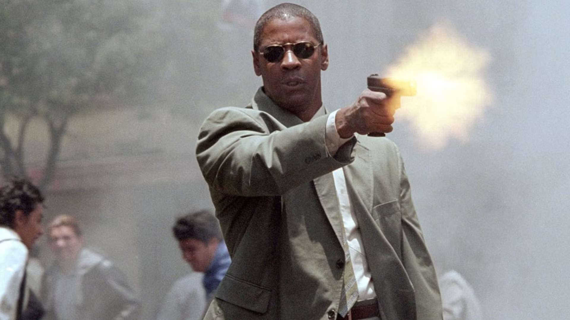
Long before Keanu Reeves and Liam Neeson became action heroes, Denzel Washington was fighting off the bad guys in an exceptional thriller based on a bestselling novel. Perfect for those who love John Wick and Taken, the movie has just blasted onto free streaming, making now as good a time as any to revisit it.
Denzel Washington Beings the Heat in a Fiery Action Thriller
Hitting theaters in 2004, Washington leads Man on Fire as John Creasy, a highly trained former government operative struggling with alcoholism and depression. Traveling to Mexico to visit his old friend Paul Rayburn (Christopher Walken), Creasy takes a job protecting the nine-year-old daughter of a wealthy automaker. Seems easy enough for a guy like him.
However, things take a turn for the worse when the girl is kidnapped on Creasy’s watch. Unfortunately for the bad guys, he transforms back into the relentless killing machine he was in his old life and embarks on a violent mission of revenge against everyone responsible.
/* Streaming Top 10 vignette. All rules are scoped under .st10.
One card with two faces (Movies, TV) that flips in 3D. Movies follows the
reader’s light/dark setting and TV is the opposite, so a flip always
changes the colour scheme. Neutrals are sampled from movieweb.com; the
open streamer’s brand colour (adapted for contrast) drives the frame,
active tab, highlight, change arrows and NEW badge. */
.st10 {
–st10-heading-font: ‘Poppins’, Arial, Helvetica, sans-serif;
–st10-body-font: ‘Roboto’, Arial, Helvetica, sans-serif;
/* Stat column widths */
–st10-w-change: 4.5rem;
–st10-w-days: 6.5rem;
–st10-w-rt: 3.75rem;
–st10-w-episodes: 5rem;
–st10-w-peak: 3.75rem;
–st10-w-runtime: 4.75rem;
–st10-w-weeks: 4.25rem;
/* Space between columns, carried by each cell’s left padding (a real
column gap would let scrolled cells show between the pinned columns) */
–st10-gap: 8px;
–st10-w-views: 4.75rem;
–st10-w-hours: 4.75rem;
box-sizing: border-box;
max-width: 760px;
margin: 24px auto;
font-family: var(–st10-body-font);
font-size: 15px;
line-height: 1.4;
container: st10 / inline-size;
}
.st10 *,
.st10 *::before,
.st10 *::after { box-sizing: inherit; }
/* CMS fields: never visible, whatever the host CSS does */
.st10 [data-st10-field] { display: none !important; }
.st10[hidden],
.st10 [hidden] { display: none !important; }
.st10 .st10__sr {
position: absolute !important;
width: 1px; height: 1px; margin: -1px; padding: 0;
overflow: hidden; clip: rect(0 0 0 0); white-space: nowrap; border: 0;
}
/* —- Static frame from the HTML block: shows until the script swaps in
the live chart (and in editors that don’t run scripts). Follows the
reader’s light/dark setting. —- */
.st10 .st10__shell {
–st10-panel: #ffffff; –st10-card: #f2f2f2; –st10-text: #181818; –st10-muted: #6b6b6b;
–st10-heading: #555555; –st10-rule: #e4e4e4; –st10-btn: #737373; –st10-btn-text: #ffffff;
–svc-ink: var(–svc-ink-l);
padding: 16px 16px 12px;
border: 1px solid var(–st10-rule);
border-color: color-mix(in srgb, var(–svc-fill) 55%, var(–st10-panel));
border-radius: 4px;
background: var(–st10-panel);
color: var(–st10-text);
}
@media (prefers-color-scheme: dark) {
.st10 .st10__shell {
–st10-panel: #181818; –st10-card: #333333; –st10-text: #ffffff; –st10-muted: #b0b0b0;
–st10-heading: #b0b0b0; –st10-rule: #2c2c2c; –svc-ink: var(–svc-ink-d);
}
}
/* A block can fix its theme with data-st10-theme=”light” or “dark” */
.st10[data-st10-theme=”dark”] .st10__shell {
–st10-panel: #181818; –st10-card: #333333; –st10-text: #ffffff; –st10-muted: #b0b0b0;
–st10-heading: #b0b0b0; –st10-rule: #2c2c2c; –svc-ink: var(–svc-ink-d);
}
.st10[data-st10-theme=”light”] .st10__shell {
–st10-panel: #ffffff; –st10-card: #f2f2f2; –st10-text: #181818; –st10-muted: #6b6b6b;
–st10-heading: #555555; –st10-rule: #e4e4e4; –svc-ink: var(–svc-ink-l);
}
.st10 .st10__shell .st10__flipbtn.is-on,
.st10 .st10__shell .st10__tab.is-on { background: var(–svc-fill); color: var(–svc-on); }
.st10 .st10__shell .st10__tab.is-on { box-shadow: 0 0 0 2px var(–st10-panel), 0 0 0 3px var(–svc-fill); }
.st10 .st10__shell .st10__flipbtn { cursor: default; }
.st10 .st10__skeleton { display: grid; }
/* Same height as the table’s column-header row, so nothing jumps when the chart arrives */
.st10 .st10__skeleton b { display: block; height: 27px; }
.st10 .st10__shell .st10__btn { cursor: default; }
.st10 .st10__skeleton i {
display: block;
height: 42px;
border-top: 1px solid var(–st10-rule);
background: linear-gradient(var(–st10-card), var(–st10-card)) 8px 50% / 55% 10px no-repeat;
opacity: 0.7;
}
/* Preview-only status line (why the widget couldn’t load) */
.st10 .st10__note {
margin: 8px 0 0;
padding: 12px 14px;
border: 1px dashed #737373;
border-radius: 4px;
background: #f2f2f2;
color: #181818;
font-size: 14px;
line-height: 1.4;
}
/* —- Themes (set per face) —- */
.st10 .st10__face.is-light {
–st10-panel: #ffffff;
–st10-card: #f2f2f2;
–st10-text: #181818;
–st10-muted: #6b6b6b;
–st10-heading: #555555;
–st10-rule: #e4e4e4;
–st10-btn: #737373;
–st10-btn-text: #ffffff;
–svc-ink: var(–svc-ink-l);
–st10-up: #0b5c2b;
–st10-down: #8f1218;
color-scheme: light;
}
.st10 .st10__face.is-dark {
–st10-panel: #181818;
–st10-card: #333333;
–st10-text: #ffffff;
–st10-muted: #b0b0b0;
–st10-heading: #b0b0b0;
–st10-rule: #2c2c2c;
–st10-btn: #737373;
–st10-btn-text: #ffffff;
–svc-ink: var(–svc-ink-d);
–st10-up: #4ade80;
–st10-down: #ffa3a3;
color-scheme: dark;
}
/* —- Streamer colours: fill, text on fill, ink for dark and light panels —- */
.st10 [data-svc] { –svc-fill: #de272e; –svc-on: #ffffff; –svc-ink-d: #ff5a5f; –svc-ink-l: #c81e25; }
.st10 [data-svc=”netflix”] { –svc-fill: #e50914; –svc-on: #ffffff; –svc-ink-d: #ff4a52; –svc-ink-l: #c20710; }
.st10 [data-svc=”prime”] { –svc-fill: #0f79d0; –svc-on: #ffffff; –svc-ink-d: #5cb6ff; –svc-ink-l: #0b6ab8; }
.st10 [data-svc=”max”] { –svc-fill: #5b2eff; –svc-on: #ffffff; –svc-ink-d: #a391ff; –svc-ink-l: #4a22e0; }
.st10 [data-svc=”disney”] { –svc-fill: #0e7c99; –svc-on: #ffffff; –svc-ink-d: #3fc1df; –svc-ink-l: #0b6f89; }
.st10 [data-svc=”paramount”] { –svc-fill: #0064ff; –svc-on: #ffffff; –svc-ink-d: #6ea3ff; –svc-ink-l: #0057dd; }
.st10 [data-svc=”hulu”] { –svc-fill: #1ce783; –svc-on: #05241a; –svc-ink-d: #1ce783; –svc-ink-l: #0a8a4b; }
.st10 [data-svc=”apple”] { –svc-ink-d: #e5e5ea; –svc-ink-l: #1d1d1f; }
.st10 .is-dark[data-svc=”apple”],
.st10 .is-dark [data-svc=”apple”] { –svc-fill: #f5f5f7; –svc-on: #111111; }
.st10 .is-light[data-svc=”apple”],
.st10 .is-light [data-svc=”apple”] { –svc-fill: #1d1d1f; –svc-on: #ffffff; }
/* —- The flipping card —- */
/* overflow-x: clip keeps a sideways-scrolling table inside a 3D card from
widening the page (Chrome lets it leak otherwise); vertical stays open */
.st10 .st10__card { perspective: 2000px; overflow-x: clip; }
.st10 .st10__spin {
position: relative;
transform-style: preserve-3d;
transition: transform 0.75s cubic-bezier(0.3, 0.7, 0.2, 1), height 0.35s ease;
}
.st10 .st10__spin.is-flipped { transform: rotateY(180deg); }
.st10 .st10__spin.no-anim { transition: none; }
.st10 .st10__face {
position: absolute;
top: 0;
left: 0;
right: 0;
padding: 16px 16px 12px;
border: 1px solid var(–st10-rule);
border-color: color-mix(in srgb, var(–svc-fill) 55%, var(–st10-panel));
border-radius: 4px;
background: var(–st10-panel);
color: var(–st10-text);
-webkit-backface-visibility: hidden;
backface-visibility: hidden;
transition: border-color 0.2s ease;
}
.st10 .st10__face + .st10__face { transform: rotateY(180deg); }
/* The side facing away, once the flip has finished: hidden outright, so no
browser can show any of it through the front */
.st10 .st10__face.is-away { visibility: hidden; }
@media (prefers-reduced-motion: reduce) {
.st10 .st10__spin { transition: none; }
}
.st10 button {
font: inherit;
color: inherit;
background: none;
border: 0;
margin: 0;
padding: 0;
cursor: pointer;
text-transform: none;
letter-spacing: normal;
}
/* Site link styles must not reach inside the widget (no double underlines) */
.st10 a,
.st10 a:hover,
.st10 a:visited {
border: 0 !important;
box-shadow: none !important;
background-image: none !important;
background-color: transparent !important;
}
.st10 a::before,
.st10 a::after { content: none !important; display: none !important; }
.st10 button:focus-visible,
.st10 a:focus-visible {
outline: 2px solid var(–svc-ink);
outline-offset: 2px;
}
/* —- Header: the site’s panel heading, with the Movies / TV switch —- */
.st10 .st10__head {
display: flex;
flex-wrap: wrap;
align-items: flex-start;
justify-content: space-between;
gap: 10px 16px;
margin: 0 0 12px;
}
.st10 .st10__titles { min-width: 0; }
.st10 .st10__title {
margin: 0;
padding: 0;
border: 0;
font-family: var(–st10-heading-font);
font-size: 20px;
font-weight: 600;
line-height: 1.2;
text-transform: uppercase;
color: var(–st10-heading);
}
.st10 .st10__date {
margin: 4px 0 0;
font-size: 13px;
color: var(–st10-muted);
}
.st10 .st10__flip {
display: inline-flex;
flex: none;
padding: 2px;
border-radius: 3px;
background: var(–st10-card);
}
.st10 .st10__flipbtn {
padding: 6px 12px;
border-radius: 2px;
color: var(–st10-muted);
font-family: var(–st10-heading-font);
font-size: 11px;
font-weight: 600;
line-height: 1.2;
text-transform: uppercase;
}
.st10 .st10__flipbtn:hover { color: var(–st10-text); }
.st10 .st10__flipbtn[aria-pressed=”true”] { background: var(–svc-fill); color: var(–svc-on); }
/* —- Service tabs: the site’s filter buttons, filled with the brand when open —- */
.st10 .st10__tabs {
display: flex;
flex-wrap: wrap;
gap: 6px;
margin: 0 0 12px;
}
.st10 .st10__tab,
.st10 .st10__btn {
display: inline-flex;
align-items: center;
gap: 5px;
padding: 6px 9px;
border-radius: 2px;
background: var(–st10-btn);
color: var(–st10-btn-text);
font-family: var(–st10-heading-font);
font-size: 11px;
font-weight: 600;
line-height: 1.2;
text-transform: uppercase;
white-space: nowrap;
}
.st10 .st10__tab:hover,
.st10 .st10__btn:hover { filter: brightness(1.12); }
.st10 .st10__btn–quiet {
background: transparent;
color: var(–st10-muted);
box-shadow: inset 0 0 0 1px var(–st10-rule);
}
.st10 .st10__btn–quiet:hover { color: var(–st10-text); filter: none; }
/* Tab layout by the widget’s width, for the static frame and the live card
alike: one row from 576px; below that even rows of equal buttons, at most
4 a row (the script sets –st10-tabcols from the tab count: 7 -> 4 + 3);
below 440px, where 4 no longer fit, one row that swipes sideways, never
uneven rows like 3 + 3 + 1. The 3px padding keeps the open tab’s ring
visible; the scrollbar is hidden (swipe, or arrow keys). */
@container st10 (max-width: 575.98px) {
.st10 .st10__tabs { display: grid; grid-template-columns: repeat(var(–st10-tabcols, 4), minmax(0, 1fr)); }
.st10 .st10__tabs .st10__tab { justify-content: center; }
}
@container st10 (max-width: 439.98px) {
.st10 .st10__tabs {
display: flex;
flex-wrap: nowrap;
overflow-x: auto;
padding: 3px;
margin-left: -3px;
margin-right: -3px;
scrollbar-width: none;
-webkit-overflow-scrolling: touch;
}
.st10 .st10__tabs::-webkit-scrollbar { display: none; }
.st10 .st10__tabs .st10__tab { flex: none; }
}
.st10 .st10__tab.is-on {
background: var(–svc-fill);
color: var(–svc-on);
box-shadow: 0 0 0 2px var(–st10-panel), 0 0 0 3px var(–svc-fill);
}
/* Two-row picker (Netflix). The top row is the main choice: solid fill when
selected, without the ring, so two rows don’t stack two heavy buttons.
The second row (language, or countries in the grouped layout) is quieter:
outlined buttons, the selected one in the accent’s outline and text. */
.st10 .st10__tabs–region { margin-bottom: 6px; }
.st10 .st10__tabs–region:last-child { margin-bottom: 12px; }
/* Prime has one row only: the loading frame keeps the same gap below it */
.st10[data-st10-variant=”prime”] .st10__shell .st10__tabs–region { margin-bottom: 12px; }
.st10 .st10__tabs–lang,
.st10 .st10__tabs–country { margin-bottom: 12px; }
.st10 .st10__tabs–region .st10__tab.is-on,
.st10 .st10__shell .st10__tabs–region .st10__tab.is-on { box-shadow: none; }
.st10 .st10__tabs–lang .st10__tab,
.st10 .st10__tabs–country .st10__tab,
.st10 .st10__shell .st10__tabs–lang .st10__tab {
background: transparent;
color: var(–st10-muted);
box-shadow: inset 0 0 0 1px var(–st10-rule);
}
.st10 .st10__tabs–lang .st10__tab:hover,
.st10 .st10__tabs–country .st10__tab:hover { color: var(–st10-text); filter: none; }
.st10 .st10__tabs–lang .st10__tab.is-on,
.st10 .st10__tabs–country .st10__tab.is-on,
.st10 .st10__shell .st10__tabs–lang .st10__tab.is-on {
background: var(–svc-fill);
color: var(–svc-on);
box-shadow: none;
font-weight: 700;
}
/* The picker rows fill the card’s width with equal buttons: one row when
wide (–st10-count is the number of buttons), even rows of at most 4 when
narrower (–st10-tabcols). Short labels, so they wrap rather than swipe. */
.st10 .st10__tabs.st10__tabs–region,
.st10 .st10__tabs.st10__tabs–lang,
.st10 .st10__tabs.st10__tabs–country {
display: grid;
grid-template-columns: repeat(var(–st10-count, 3), minmax(0, 1fr));
gap: 4px;
overflow: visible;
padding: 0;
margin-left: 0;
margin-right: 0;
}
.st10 .st10__tabs–region .st10__tab,
.st10 .st10__tabs–lang .st10__tab,
.st10 .st10__tabs–country .st10__tab { justify-content: center; flex: initial; }
@container st10 (max-width: 575.98px) {
.st10 .st10__tabs.st10__tabs–region,
.st10 .st10__tabs.st10__tabs–lang,
.st10 .st10__tabs.st10__tabs–country { grid-template-columns: repeat(var(–st10-tabcols, 3), minmax(0, 1fr)); }
}
@container st10 (max-width: 439.98px) {
.st10 .st10__tabs–region .st10__tab,
.st10 .st10__tabs–lang .st10__tab,
.st10 .st10__tabs–country .st10__tab { padding-left: 4px; padding-right: 4px; }
}
.st10 .st10__tab[disabled] { opacity: 0.4; cursor: default; }
.st10 .st10__tab[disabled]:hover { filter: none; }
/* Marks a tab the article’s title is on */
.st10 .st10__dot {
width: 6px;
height: 6px;
border-radius: 50%;
background: currentColor;
}
/* —- Table: one CSS grid per row; –st10-grid is set per table —- */
.st10 .st10__scroll { overflow-x: auto; }
.st10 .st10__scroll:focus-visible { outline: 2px solid var(–svc-ink); outline-offset: 2px; }
.st10 .st10__table { font-variant-numeric: tabular-nums; }
.st10 .st10__row {
–st10-rowbg: var(–st10-panel);
display: grid;
/* The title never gets narrower than 11rem; past that the stats scroll
sideways, with rank and title pinned */
grid-template-columns: calc(2rem + var(–st10-gap)) minmax(calc(11rem + var(–st10-gap)), 1fr) var(–st10-grid);
align-items: center;
column-gap: 0;
min-height: 42px;
padding: 0 8px 0 0;
border-top: 1px solid var(–st10-rule);
background: var(–st10-rowbg);
}
.st10 .st10__row–head {
align-items: end;
min-height: 0;
padding-bottom: 6px;
border-top: 0;
}
.st10 .st10__th,
.st10 .st10__td { min-width: 0; text-align: center; padding-left: var(–st10-gap); }
.st10 .st10__table { min-width: calc(2rem + 11rem + 2 * var(–st10-gap) + var(–st10-stats, 0rem) + 8px); }
/* Rank and title stay put while the stats scroll sideways */
.st10 .st10__td–rank,
.st10 .st10__th–rank,
.st10 .st10__td–title,
.st10 .st10__th–title {
position: sticky;
z-index: 1;
align-self: stretch;
display: flex;
align-items: center;
background: var(–st10-rowbg);
/* Safari (and every iPhone browser) draws pinned cells on their own layer
and ignores the face’s backface-visibility for them, so the far side’s
titles showed through mirrored. Each pinned cell hides its own back. */
-webkit-backface-visibility: hidden;
backface-visibility: hidden;
}
.st10 .st10__row–head .st10__th–rank,
.st10 .st10__row–head .st10__th–title { align-items: flex-end; }
.st10 .st10__td–rank,
.st10 .st10__th–rank { left: 0; justify-content: center; }
.st10 .st10__td–title,
.st10 .st10__th–title { left: calc(2rem + var(–st10-gap)); padding-right: 6px; }
.st10 .st10__scroll.is-scrolled .st10__td–title,
.st10 .st10__scroll.is-scrolled .st10__th–title { box-shadow: 6px 0 6px -6px rgba(0, 0, 0, 0.35); }
.st10 .st10__th–title,
.st10 .st10__td–title { text-align: left; }
.st10 .st10__sort {
display: inline-flex;
align-items: flex-end;
justify-content: center;
gap: 2px;
max-width: 100%;
padding: 2px;
color: var(–st10-muted);
font-family: var(–st10-heading-font);
font-size: 11px;
font-weight: 600;
line-height: 1.2;
text-transform: uppercase;
text-align: inherit;
}
.st10 .st10__th–title .st10__sort { justify-content: flex-start; }
.st10 .st10__sort:hover { color: var(–st10-text); }
.st10 .st10__sort.is-on { color: var(–svc-ink); }
.st10 .st10__arrow { flex: none; min-width: 0.6em; }
.st10 .st10__td–rank {
font-family: var(–st10-heading-font);
font-size: 16px;
font-weight: 700;
color: var(–st10-muted);
}
/* Title: always one line, so every row is the same height */
.st10 .st10__td–title {
display: flex;
align-items: center;
gap: 5px;
}
.st10 .st10__name {
min-width: 0;
overflow: hidden;
text-overflow: ellipsis;
white-space: nowrap;
font-weight: 500;
color: inherit;
text-decoration: none;
}
.st10 a.st10__name {
text-decoration: underline;
text-decoration-color: color-mix(in srgb, var(–svc-ink) 45%, transparent);
text-underline-offset: 3px;
}
.st10 a.st10__name:hover { color: var(–svc-ink); text-decoration-color: currentColor; }
.st10 .st10__year {
flex: none;
color: var(–st10-muted);
font-size: 13px;
}
/* A TV season label gives way to the show’s name: it shrinks first */
.st10 .st10__name { flex: 0 1 auto; }
.st10 .st10__season {
flex: 0 4 auto;
min-width: 0;
overflow: hidden;
text-overflow: ellipsis;
white-space: nowrap;
color: var(–st10-muted);
font-size: 13px;
}
.st10 .st10__na { color: var(–st10-muted); }
.st10 .st10__chg { font-weight: 700; font-size: 13px; white-space: nowrap; }
/* Movement is green up, red down in every streamer colour (checked for
contrast on both panels and the highlighted row) */
.st10 .st10__chg–up { color: var(–st10-up); }
.st10 .st10__chg–down { color: var(–st10-down); }
.st10 .st10__chg–same { color: var(–st10-muted); }
.st10 .st10__chg–new {
padding: 2px 5px;
border-radius: 2px;
background: var(–svc-fill);
color: var(–svc-on);
font-family: var(–st10-heading-font);
font-size: 10px;
font-weight: 600;
letter-spacing: 0.02em;
}
/* Rows with a hub page: the whole row opens it */
.st10 .st10__row.is-link { cursor: pointer; }
.st10 .st10__row.is-link:hover {
–st10-rowbg: color-mix(in srgb, var(–st10-text) 7%, var(–st10-panel));
}
.st10 .st10__row.is-link:hover .st10__name { color: var(–svc-ink); text-decoration-color: currentColor; }
/* The article’s title: a brand-tinted row */
.st10 .st10__row.is-subject {
–st10-rowbg: color-mix(in srgb, var(–svc-fill) 16%, var(–st10-panel));
border-radius: 2px;
}
.st10 .st10__row.is-subject.is-link:hover {
–st10-rowbg: color-mix(in srgb, var(–svc-fill) 26%, var(–st10-panel));
}
.st10 .st10__row.is-subject .st10__td–rank { color: var(–svc-ink); }
.st10 .st10__row.is-subject .st10__name { font-weight: 700; }
.st10 .st10__row.is-subject + .st10__row { border-top-color: transparent; }
/* —- Toggle and footer —- */
.st10 .st10__controls {
display: flex;
flex-wrap: wrap;
gap: 6px;
margin: 12px 0 0;
}
.st10 .st10__foot {
margin: 10px 0 0;
font-size: 11px;
color: var(–st10-muted);
}
/* —- Narrow: every column stays; the table scrolls sideways with the
rank and title pinned —- */
@container st10 (max-width: 600px) {
.st10 .st10__card,
.st10 .st10__shell {
–st10-w-change: 3.2rem;
–st10-w-days: 4rem;
–st10-w-rt: 3rem;
–st10-w-episodes: 4.2rem;
–st10-w-peak: 3rem;
–st10-w-runtime: 4.2rem;
–st10-w-weeks: 3.6rem;
–st10-gap: 0px;
–st10-w-views: 4rem;
–st10-w-hours: 4rem;
}
.st10 .st10__face { padding: 14px 12px 10px; }
.st10 .st10__shell { padding: 14px 12px 10px; }
.st10 .st10__skeleton b { height: 31px; }
/* Netflix’s narrow headers are all one line (Change, Weeks, Views) */
.st10[data-st10-variant=”netflix”] .st10__skeleton b,
.st10[data-st10-variant=”prime”] .st10__skeleton b { height: 20px; }
.st10 .st10__title { font-size: 17px; }
/* The title takes whatever width the stats leave, down to 8.5rem; only
below that does the table scroll sideways */
.st10 .st10__table { width: 100%; min-width: calc(1.6rem + 8.5rem + var(–st10-stats, 0rem) + 4px); font-size: 14px; }
.st10 .st10__season { font-size: 12px; }
.st10 .st10__year { font-size: 12px; }
/* No column gap here: scrolled cells would show through it between the
pinned columns. Cells pad themselves instead. */
.st10 .st10__row {
grid-template-columns: 1.6rem minmax(8.5rem, 1fr) var(–st10-grid);
padding: 0 4px 0 0;
}
.st10 .st10__th,
.st10 .st10__td { padding-left: 4px; }
.st10 .st10__td–rank,
.st10 .st10__th–rank { box-shadow: -4px 0 0 var(–st10-rowbg); }
.st10 .st10__td–title,
.st10 .st10__th–title { left: 1.6rem; padding-right: 4px; }
.st10 .st10__td–rank { font-size: 15px; }
.st10 .st10__sort { font-size: 10px; }
}
Based on the 1980 novel of the same name by A. J. Quinnell, Man on Fire is an uncompromising movie that blends emotional storytelling with visceral brutality to deliver a revenge film that, at times, is surprisingly tender. One of its greatest strengths is the relationship between Creasy and young Pita (played by Dakota Fanning), which helps elevate it beyond a conventional action thriller before all hell breaks loose in the movie’s second and third acts.
That being said, while Man on Fire is often cited as one of Washington’s best action movies, critics didn’t have many good things to say about it. To this day, the film holds just a 38% rating on Rotten Tomatoes, with the consensus being that the movie’s “solid action and top-shelf cast are undone by a relentlessly grim story that gets harder to take the longer it goes on.” Audiences appreciated the adaptation way more, scoring it 89%.
‘Man on Fire’ Is Now Streaming Free
After being unavailable for a hot minute on any major streaming platform in the United States, Man on Fire has officially made its way back onto free streaming. Washington’s top-notch action thriller is now available on Pluto TV, meaning it won’t cost you anything but a few ad breaks to enjoy it for the first, or hundredth time.
Of course, the 2004 film wasn’t the first adaptation of Quinnell’s novel, nor was it the last. The book first exploded onto the big screen in a 1987 movie starring Scott Glenn as Creasy, and though it’s not as good as Washington’s film that was directed by the late great Tony Scott, it’s still a decent 80s action thriller that’s worth tracking down.
The third adaptation of the novel came thanks to Netflix. It was developed into a series that premiered earlier this year and stars Yahya Abdul-Mateen II as the ex-mercenary out for revenge. That being said, Netflix’s version of Man on Fire makes significant changes from the source material and the 2004 film, so don’t expect a beat-for-beat remake if you decide to binge-watch all seven episodes.