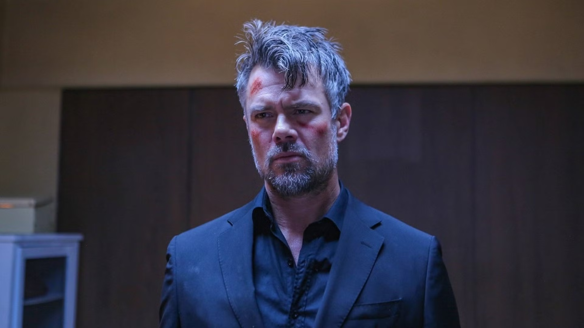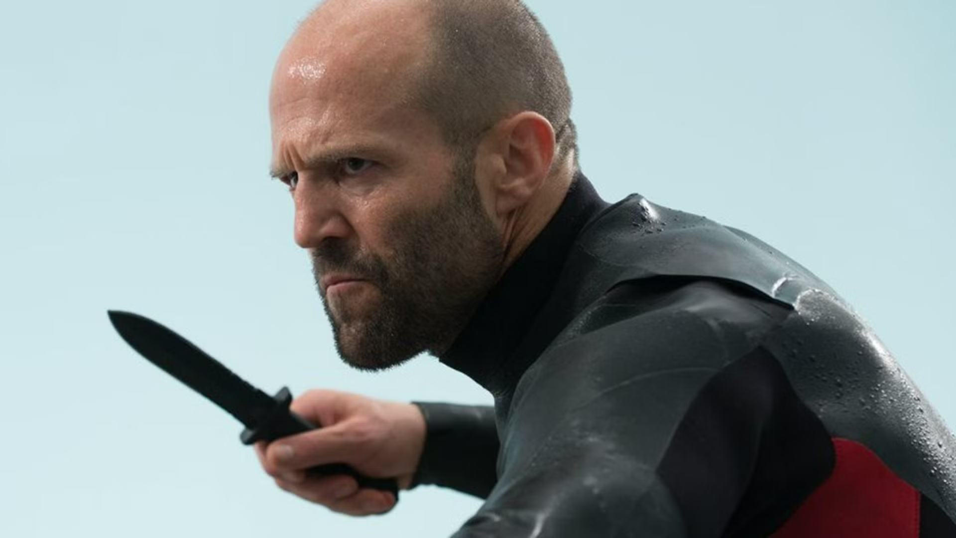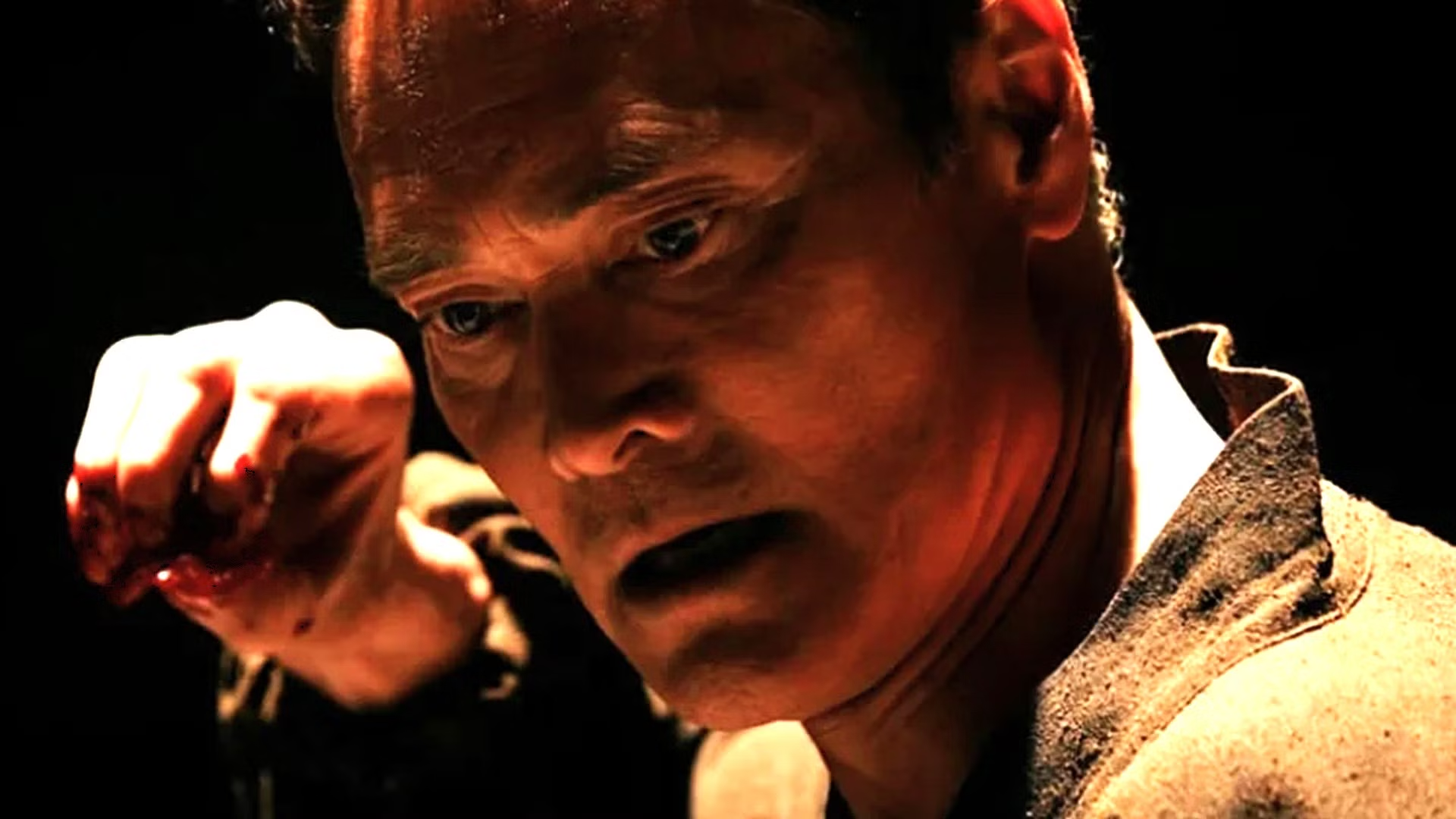
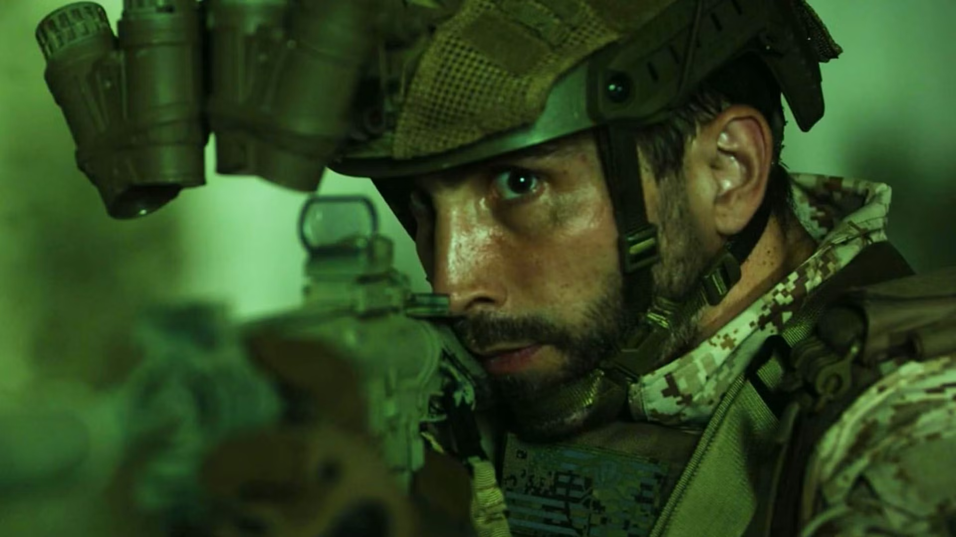

An overlooked thriller that combines all the action of SEAL Team with the combat of Ridley Scott’s Gladiator has just landed on free streaming after first being released on VOD earlier this year. Directed by Tommy Jackson, the low-budget military action thriller might not be for everyone, but some viewers have gone so far as to call it an “unapologetic hit.”
Navy SEALs Fight For Their Life in a Brutal Action Thriller
Starring James William Clark, Matthew Gray, Felix Alexander and Russell Shealy, Land of Wolves follows four elite Navy SEALs whose covert rescue mission to save a captured commander goes horribly wrong. Ambushed and taken prisoner by a mysterious organization, the men are forced into an underground deathmatch tournament that sees them compete in some brutal gladiatorial-style combat.
With no weapons and seemingly no way out, the soldiers must rely on their military training, combat skills and loyalty to one another to survive the increasingly brutal competition, but that’s not their only goal. They don’t just want to live – they want to dismantle the organization from the inside and expose the people financing the sadistic game.
/* Streaming Top 10 vignette. All rules are scoped under .st10.
One card with two faces (Movies, TV) that flips in 3D. Movies follows the
reader’s light/dark setting and TV is the opposite, so a flip always
changes the colour scheme. Neutrals are sampled from movieweb.com; the
open streamer’s brand colour (adapted for contrast) drives the frame,
active tab, highlight, change arrows and NEW badge. */
.st10 {
–st10-heading-font: ‘Poppins’, Arial, Helvetica, sans-serif;
–st10-body-font: ‘Roboto’, Arial, Helvetica, sans-serif;
/* Stat column widths */
–st10-w-change: 4.5rem;
–st10-w-days: 6.5rem;
–st10-w-rt: 3.75rem;
–st10-w-episodes: 5rem;
–st10-w-peak: 3.75rem;
–st10-w-runtime: 4.75rem;
–st10-w-weeks: 4.25rem;
/* Space between columns, carried by each cell’s left padding (a real
column gap would let scrolled cells show between the pinned columns) */
–st10-gap: 8px;
–st10-w-views: 4.75rem;
–st10-w-hours: 4.75rem;
box-sizing: border-box;
max-width: 760px;
margin: 24px auto;
font-family: var(–st10-body-font);
font-size: 15px;
line-height: 1.4;
container: st10 / inline-size;
}
.st10 *,
.st10 *::before,
.st10 *::after { box-sizing: inherit; }
/* CMS fields: never visible, whatever the host CSS does */
.st10 [data-st10-field] { display: none !important; }
.st10[hidden],
.st10 [hidden] { display: none !important; }
.st10 .st10__sr {
position: absolute !important;
width: 1px; height: 1px; margin: -1px; padding: 0;
overflow: hidden; clip: rect(0 0 0 0); white-space: nowrap; border: 0;
}
/* —- Static frame from the HTML block: shows until the script swaps in
the live chart (and in editors that don’t run scripts). Follows the
reader’s light/dark setting. —- */
.st10 .st10__shell {
–st10-panel: #ffffff; –st10-card: #f2f2f2; –st10-text: #181818; –st10-muted: #6b6b6b;
–st10-heading: #555555; –st10-rule: #e4e4e4; –st10-btn: #737373; –st10-btn-text: #ffffff;
–svc-ink: var(–svc-ink-l);
padding: 16px 16px 12px;
border: 1px solid var(–st10-rule);
border-color: color-mix(in srgb, var(–svc-fill) 55%, var(–st10-panel));
border-radius: 4px;
background: var(–st10-panel);
color: var(–st10-text);
}
@media (prefers-color-scheme: dark) {
.st10 .st10__shell {
–st10-panel: #181818; –st10-card: #333333; –st10-text: #ffffff; –st10-muted: #b0b0b0;
–st10-heading: #b0b0b0; –st10-rule: #2c2c2c; –svc-ink: var(–svc-ink-d);
}
}
/* A block can fix its theme with data-st10-theme=”light” or “dark” */
.st10[data-st10-theme=”dark”] .st10__shell {
–st10-panel: #181818; –st10-card: #333333; –st10-text: #ffffff; –st10-muted: #b0b0b0;
–st10-heading: #b0b0b0; –st10-rule: #2c2c2c; –svc-ink: var(–svc-ink-d);
}
.st10[data-st10-theme=”light”] .st10__shell {
–st10-panel: #ffffff; –st10-card: #f2f2f2; –st10-text: #181818; –st10-muted: #6b6b6b;
–st10-heading: #555555; –st10-rule: #e4e4e4; –svc-ink: var(–svc-ink-l);
}
.st10 .st10__shell .st10__flipbtn.is-on,
.st10 .st10__shell .st10__tab.is-on { background: var(–svc-fill); color: var(–svc-on); }
.st10 .st10__shell .st10__tab.is-on { box-shadow: 0 0 0 2px var(–st10-panel), 0 0 0 3px var(–svc-fill); }
.st10 .st10__shell .st10__flipbtn { cursor: default; }
.st10 .st10__skeleton { display: grid; }
/* Same height as the table’s column-header row, so nothing jumps when the chart arrives */
.st10 .st10__skeleton b { display: block; height: 27px; }
.st10 .st10__shell .st10__btn { cursor: default; }
.st10 .st10__skeleton i {
display: block;
height: 42px;
border-top: 1px solid var(–st10-rule);
background: linear-gradient(var(–st10-card), var(–st10-card)) 8px 50% / 55% 10px no-repeat;
opacity: 0.7;
}
/* Preview-only status line (why the widget couldn’t load) */
.st10 .st10__note {
margin: 8px 0 0;
padding: 12px 14px;
border: 1px dashed #737373;
border-radius: 4px;
background: #f2f2f2;
color: #181818;
font-size: 14px;
line-height: 1.4;
}
/* —- Themes (set per face) —- */
.st10 .st10__face.is-light {
–st10-panel: #ffffff;
–st10-card: #f2f2f2;
–st10-text: #181818;
–st10-muted: #6b6b6b;
–st10-heading: #555555;
–st10-rule: #e4e4e4;
–st10-btn: #737373;
–st10-btn-text: #ffffff;
–svc-ink: var(–svc-ink-l);
–st10-up: #0b5c2b;
–st10-down: #8f1218;
color-scheme: light;
}
.st10 .st10__face.is-dark {
–st10-panel: #181818;
–st10-card: #333333;
–st10-text: #ffffff;
–st10-muted: #b0b0b0;
–st10-heading: #b0b0b0;
–st10-rule: #2c2c2c;
–st10-btn: #737373;
–st10-btn-text: #ffffff;
–svc-ink: var(–svc-ink-d);
–st10-up: #4ade80;
–st10-down: #ffa3a3;
color-scheme: dark;
}
/* —- Streamer colours: fill, text on fill, ink for dark and light panels —- */
.st10 [data-svc] { –svc-fill: #de272e; –svc-on: #ffffff; –svc-ink-d: #ff5a5f; –svc-ink-l: #c81e25; }
.st10 [data-svc=”netflix”] { –svc-fill: #e50914; –svc-on: #ffffff; –svc-ink-d: #ff4a52; –svc-ink-l: #c20710; }
.st10 [data-svc=”prime”] { –svc-fill: #0f79d0; –svc-on: #ffffff; –svc-ink-d: #5cb6ff; –svc-ink-l: #0b6ab8; }
.st10 [data-svc=”max”] { –svc-fill: #5b2eff; –svc-on: #ffffff; –svc-ink-d: #a391ff; –svc-ink-l: #4a22e0; }
.st10 [data-svc=”disney”] { –svc-fill: #0e7c99; –svc-on: #ffffff; –svc-ink-d: #3fc1df; –svc-ink-l: #0b6f89; }
.st10 [data-svc=”paramount”] { –svc-fill: #0064ff; –svc-on: #ffffff; –svc-ink-d: #6ea3ff; –svc-ink-l: #0057dd; }
.st10 [data-svc=”hulu”] { –svc-fill: #1ce783; –svc-on: #05241a; –svc-ink-d: #1ce783; –svc-ink-l: #0a8a4b; }
.st10 [data-svc=”apple”] { –svc-ink-d: #e5e5ea; –svc-ink-l: #1d1d1f; }
.st10 .is-dark[data-svc=”apple”],
.st10 .is-dark [data-svc=”apple”] { –svc-fill: #f5f5f7; –svc-on: #111111; }
.st10 .is-light[data-svc=”apple”],
.st10 .is-light [data-svc=”apple”] { –svc-fill: #1d1d1f; –svc-on: #ffffff; }
/* —- The flipping card —- */
/* overflow-x: clip keeps a sideways-scrolling table inside a 3D card from
widening the page (Chrome lets it leak otherwise); vertical stays open */
.st10 .st10__card { perspective: 2000px; overflow-x: clip; }
.st10 .st10__spin {
position: relative;
transform-style: preserve-3d;
transition: transform 0.75s cubic-bezier(0.3, 0.7, 0.2, 1), height 0.35s ease;
}
.st10 .st10__spin.is-flipped { transform: rotateY(180deg); }
.st10 .st10__spin.no-anim { transition: none; }
.st10 .st10__face {
position: absolute;
top: 0;
left: 0;
right: 0;
padding: 16px 16px 12px;
border: 1px solid var(–st10-rule);
border-color: color-mix(in srgb, var(–svc-fill) 55%, var(–st10-panel));
border-radius: 4px;
background: var(–st10-panel);
color: var(–st10-text);
-webkit-backface-visibility: hidden;
backface-visibility: hidden;
transition: border-color 0.2s ease;
}
.st10 .st10__face + .st10__face { transform: rotateY(180deg); }
/* The side facing away, once the flip has finished: hidden outright, so no
browser can show any of it through the front */
.st10 .st10__face.is-away { visibility: hidden; }
@media (prefers-reduced-motion: reduce) {
.st10 .st10__spin { transition: none; }
}
.st10 button {
font: inherit;
color: inherit;
background: none;
border: 0;
margin: 0;
padding: 0;
cursor: pointer;
text-transform: none;
letter-spacing: normal;
}
/* Site link styles must not reach inside the widget (no double underlines) */
.st10 a,
.st10 a:hover,
.st10 a:visited {
border: 0 !important;
box-shadow: none !important;
background-image: none !important;
background-color: transparent !important;
}
.st10 a::before,
.st10 a::after { content: none !important; display: none !important; }
.st10 button:focus-visible,
.st10 a:focus-visible {
outline: 2px solid var(–svc-ink);
outline-offset: 2px;
}
/* —- Header: the site’s panel heading, with the Movies / TV switch —- */
.st10 .st10__head {
display: flex;
flex-wrap: wrap;
align-items: flex-start;
justify-content: space-between;
gap: 10px 16px;
margin: 0 0 12px;
}
.st10 .st10__titles { min-width: 0; }
.st10 .st10__title {
margin: 0;
padding: 0;
border: 0;
font-family: var(–st10-heading-font);
font-size: 20px;
font-weight: 600;
line-height: 1.2;
text-transform: uppercase;
color: var(–st10-heading);
}
.st10 .st10__date {
margin: 4px 0 0;
font-size: 13px;
color: var(–st10-muted);
}
.st10 .st10__flip {
display: inline-flex;
flex: none;
padding: 2px;
border-radius: 3px;
background: var(–st10-card);
}
.st10 .st10__flipbtn {
padding: 6px 12px;
border-radius: 2px;
color: var(–st10-muted);
font-family: var(–st10-heading-font);
font-size: 11px;
font-weight: 600;
line-height: 1.2;
text-transform: uppercase;
}
.st10 .st10__flipbtn:hover { color: var(–st10-text); }
.st10 .st10__flipbtn[aria-pressed=”true”] { background: var(–svc-fill); color: var(–svc-on); }
/* —- Service tabs: the site’s filter buttons, filled with the brand when open —- */
.st10 .st10__tabs {
display: flex;
flex-wrap: wrap;
gap: 6px;
margin: 0 0 12px;
}
.st10 .st10__tab,
.st10 .st10__btn {
display: inline-flex;
align-items: center;
gap: 5px;
padding: 6px 9px;
border-radius: 2px;
background: var(–st10-btn);
color: var(–st10-btn-text);
font-family: var(–st10-heading-font);
font-size: 11px;
font-weight: 600;
line-height: 1.2;
text-transform: uppercase;
white-space: nowrap;
}
.st10 .st10__tab:hover,
.st10 .st10__btn:hover { filter: brightness(1.12); }
.st10 .st10__btn–quiet {
background: transparent;
color: var(–st10-muted);
box-shadow: inset 0 0 0 1px var(–st10-rule);
}
.st10 .st10__btn–quiet:hover { color: var(–st10-text); filter: none; }
/* Tab layout by the widget’s width, for the static frame and the live card
alike: one row from 576px; below that even rows of equal buttons, at most
4 a row (the script sets –st10-tabcols from the tab count: 7 -> 4 + 3);
below 440px, where 4 no longer fit, one row that swipes sideways, never
uneven rows like 3 + 3 + 1. The 3px padding keeps the open tab’s ring
visible; the scrollbar is hidden (swipe, or arrow keys). */
@container st10 (max-width: 575.98px) {
.st10 .st10__tabs { display: grid; grid-template-columns: repeat(var(–st10-tabcols, 4), minmax(0, 1fr)); }
.st10 .st10__tabs .st10__tab { justify-content: center; }
}
@container st10 (max-width: 439.98px) {
.st10 .st10__tabs {
display: flex;
flex-wrap: nowrap;
overflow-x: auto;
padding: 3px;
margin-left: -3px;
margin-right: -3px;
scrollbar-width: none;
-webkit-overflow-scrolling: touch;
}
.st10 .st10__tabs::-webkit-scrollbar { display: none; }
.st10 .st10__tabs .st10__tab { flex: none; }
}
.st10 .st10__tab.is-on {
background: var(–svc-fill);
color: var(–svc-on);
box-shadow: 0 0 0 2px var(–st10-panel), 0 0 0 3px var(–svc-fill);
}
/* Two-row picker (Netflix). The top row is the main choice: solid fill when
selected, without the ring, so two rows don’t stack two heavy buttons.
The second row (language, or countries in the grouped layout) is quieter:
outlined buttons, the selected one in the accent’s outline and text. */
.st10 .st10__tabs–region { margin-bottom: 6px; }
.st10 .st10__tabs–region:last-child { margin-bottom: 12px; }
/* Prime has one row only: the loading frame keeps the same gap below it */
.st10[data-st10-variant=”prime”] .st10__shell .st10__tabs–region { margin-bottom: 12px; }
.st10 .st10__tabs–lang,
.st10 .st10__tabs–country { margin-bottom: 12px; }
.st10 .st10__tabs–region .st10__tab.is-on,
.st10 .st10__shell .st10__tabs–region .st10__tab.is-on { box-shadow: none; }
.st10 .st10__tabs–lang .st10__tab,
.st10 .st10__tabs–country .st10__tab,
.st10 .st10__shell .st10__tabs–lang .st10__tab {
background: transparent;
color: var(–st10-muted);
box-shadow: inset 0 0 0 1px var(–st10-rule);
}
.st10 .st10__tabs–lang .st10__tab:hover,
.st10 .st10__tabs–country .st10__tab:hover { color: var(–st10-text); filter: none; }
.st10 .st10__tabs–lang .st10__tab.is-on,
.st10 .st10__tabs–country .st10__tab.is-on,
.st10 .st10__shell .st10__tabs–lang .st10__tab.is-on {
background: var(–svc-fill);
color: var(–svc-on);
box-shadow: none;
font-weight: 700;
}
/* The picker rows fill the card’s width with equal buttons: one row when
wide (–st10-count is the number of buttons), even rows of at most 4 when
narrower (–st10-tabcols). Short labels, so they wrap rather than swipe. */
.st10 .st10__tabs.st10__tabs–region,
.st10 .st10__tabs.st10__tabs–lang,
.st10 .st10__tabs.st10__tabs–country {
display: grid;
grid-template-columns: repeat(var(–st10-count, 3), minmax(0, 1fr));
gap: 4px;
overflow: visible;
padding: 0;
margin-left: 0;
margin-right: 0;
}
.st10 .st10__tabs–region .st10__tab,
.st10 .st10__tabs–lang .st10__tab,
.st10 .st10__tabs–country .st10__tab { justify-content: center; flex: initial; }
@container st10 (max-width: 575.98px) {
.st10 .st10__tabs.st10__tabs–region,
.st10 .st10__tabs.st10__tabs–lang,
.st10 .st10__tabs.st10__tabs–country { grid-template-columns: repeat(var(–st10-tabcols, 3), minmax(0, 1fr)); }
}
@container st10 (max-width: 439.98px) {
.st10 .st10__tabs–region .st10__tab,
.st10 .st10__tabs–lang .st10__tab,
.st10 .st10__tabs–country .st10__tab { padding-left: 4px; padding-right: 4px; }
}
.st10 .st10__tab[disabled] { opacity: 0.4; cursor: default; }
.st10 .st10__tab[disabled]:hover { filter: none; }
/* Marks a tab the article’s title is on */
.st10 .st10__dot {
width: 6px;
height: 6px;
border-radius: 50%;
background: currentColor;
}
/* —- Table: one CSS grid per row; –st10-grid is set per table —- */
.st10 .st10__scroll { overflow-x: auto; }
.st10 .st10__scroll:focus-visible { outline: 2px solid var(–svc-ink); outline-offset: 2px; }
.st10 .st10__table { font-variant-numeric: tabular-nums; }
.st10 .st10__row {
–st10-rowbg: var(–st10-panel);
display: grid;
/* The title never gets narrower than 11rem; past that the stats scroll
sideways, with rank and title pinned */
grid-template-columns: calc(2rem + var(–st10-gap)) minmax(calc(11rem + var(–st10-gap)), 1fr) var(–st10-grid);
align-items: center;
column-gap: 0;
min-height: 42px;
padding: 0 8px 0 0;
border-top: 1px solid var(–st10-rule);
background: var(–st10-rowbg);
}
.st10 .st10__row–head {
align-items: end;
min-height: 0;
padding-bottom: 6px;
border-top: 0;
}
.st10 .st10__th,
.st10 .st10__td { min-width: 0; text-align: center; padding-left: var(–st10-gap); }
.st10 .st10__table { min-width: calc(2rem + 11rem + 2 * var(–st10-gap) + var(–st10-stats, 0rem) + 8px); }
/* Rank and title stay put while the stats scroll sideways */
.st10 .st10__td–rank,
.st10 .st10__th–rank,
.st10 .st10__td–title,
.st10 .st10__th–title {
position: sticky;
z-index: 1;
align-self: stretch;
display: flex;
align-items: center;
background: var(–st10-rowbg);
/* Safari (and every iPhone browser) draws pinned cells on their own layer
and ignores the face’s backface-visibility for them, so the far side’s
titles showed through mirrored. Each pinned cell hides its own back. */
-webkit-backface-visibility: hidden;
backface-visibility: hidden;
}
.st10 .st10__row–head .st10__th–rank,
.st10 .st10__row–head .st10__th–title { align-items: flex-end; }
.st10 .st10__td–rank,
.st10 .st10__th–rank { left: 0; justify-content: center; }
.st10 .st10__td–title,
.st10 .st10__th–title { left: calc(2rem + var(–st10-gap)); padding-right: 6px; }
.st10 .st10__scroll.is-scrolled .st10__td–title,
.st10 .st10__scroll.is-scrolled .st10__th–title { box-shadow: 6px 0 6px -6px rgba(0, 0, 0, 0.35); }
.st10 .st10__th–title,
.st10 .st10__td–title { text-align: left; }
.st10 .st10__sort {
display: inline-flex;
align-items: flex-end;
justify-content: center;
gap: 2px;
max-width: 100%;
padding: 2px;
color: var(–st10-muted);
font-family: var(–st10-heading-font);
font-size: 11px;
font-weight: 600;
line-height: 1.2;
text-transform: uppercase;
text-align: inherit;
}
.st10 .st10__th–title .st10__sort { justify-content: flex-start; }
.st10 .st10__sort:hover { color: var(–st10-text); }
.st10 .st10__sort.is-on { color: var(–svc-ink); }
.st10 .st10__arrow { flex: none; min-width: 0.6em; }
.st10 .st10__td–rank {
font-family: var(–st10-heading-font);
font-size: 16px;
font-weight: 700;
color: var(–st10-muted);
}
/* Title: always one line, so every row is the same height */
.st10 .st10__td–title {
display: flex;
align-items: center;
gap: 5px;
}
.st10 .st10__name {
min-width: 0;
overflow: hidden;
text-overflow: ellipsis;
white-space: nowrap;
font-weight: 500;
color: inherit;
text-decoration: none;
}
.st10 a.st10__name {
text-decoration: underline;
text-decoration-color: color-mix(in srgb, var(–svc-ink) 45%, transparent);
text-underline-offset: 3px;
}
.st10 a.st10__name:hover { color: var(–svc-ink); text-decoration-color: currentColor; }
.st10 .st10__year {
flex: none;
color: var(–st10-muted);
font-size: 13px;
}
/* A TV season label gives way to the show’s name: it shrinks first */
.st10 .st10__name { flex: 0 1 auto; }
.st10 .st10__season {
flex: 0 4 auto;
min-width: 0;
overflow: hidden;
text-overflow: ellipsis;
white-space: nowrap;
color: var(–st10-muted);
font-size: 13px;
}
.st10 .st10__na { color: var(–st10-muted); }
.st10 .st10__chg { font-weight: 700; font-size: 13px; white-space: nowrap; }
/* Movement is green up, red down in every streamer colour (checked for
contrast on both panels and the highlighted row) */
.st10 .st10__chg–up { color: var(–st10-up); }
.st10 .st10__chg–down { color: var(–st10-down); }
.st10 .st10__chg–same { color: var(–st10-muted); }
.st10 .st10__chg–new {
padding: 2px 5px;
border-radius: 2px;
background: var(–svc-fill);
color: var(–svc-on);
font-family: var(–st10-heading-font);
font-size: 10px;
font-weight: 600;
letter-spacing: 0.02em;
}
/* Rows with a hub page: the whole row opens it */
.st10 .st10__row.is-link { cursor: pointer; }
.st10 .st10__row.is-link:hover {
–st10-rowbg: color-mix(in srgb, var(–st10-text) 7%, var(–st10-panel));
}
.st10 .st10__row.is-link:hover .st10__name { color: var(–svc-ink); text-decoration-color: currentColor; }
/* The article’s title: a brand-tinted row */
.st10 .st10__row.is-subject {
–st10-rowbg: color-mix(in srgb, var(–svc-fill) 16%, var(–st10-panel));
border-radius: 2px;
}
.st10 .st10__row.is-subject.is-link:hover {
–st10-rowbg: color-mix(in srgb, var(–svc-fill) 26%, var(–st10-panel));
}
.st10 .st10__row.is-subject .st10__td–rank { color: var(–svc-ink); }
.st10 .st10__row.is-subject .st10__name { font-weight: 700; }
.st10 .st10__row.is-subject + .st10__row { border-top-color: transparent; }
/* —- Toggle and footer —- */
.st10 .st10__controls {
display: flex;
flex-wrap: wrap;
gap: 6px;
margin: 12px 0 0;
}
.st10 .st10__foot {
margin: 10px 0 0;
font-size: 11px;
color: var(–st10-muted);
}
/* —- Narrow: every column stays; the table scrolls sideways with the
rank and title pinned —- */
@container st10 (max-width: 600px) {
.st10 .st10__card,
.st10 .st10__shell {
–st10-w-change: 3.2rem;
–st10-w-days: 4rem;
–st10-w-rt: 3rem;
–st10-w-episodes: 4.2rem;
–st10-w-peak: 3rem;
–st10-w-runtime: 4.2rem;
–st10-w-weeks: 3.6rem;
–st10-gap: 0px;
–st10-w-views: 4rem;
–st10-w-hours: 4rem;
}
.st10 .st10__face { padding: 14px 12px 10px; }
.st10 .st10__shell { padding: 14px 12px 10px; }
.st10 .st10__skeleton b { height: 31px; }
/* Netflix’s narrow headers are all one line (Change, Weeks, Views) */
.st10[data-st10-variant=”netflix”] .st10__skeleton b,
.st10[data-st10-variant=”prime”] .st10__skeleton b { height: 20px; }
.st10 .st10__title { font-size: 17px; }
/* The title takes whatever width the stats leave, down to 8.5rem; only
below that does the table scroll sideways */
.st10 .st10__table { width: 100%; min-width: calc(1.6rem + 8.5rem + var(–st10-stats, 0rem) + 4px); font-size: 14px; }
.st10 .st10__season { font-size: 12px; }
.st10 .st10__year { font-size: 12px; }
/* No column gap here: scrolled cells would show through it between the
pinned columns. Cells pad themselves instead. */
.st10 .st10__row {
grid-template-columns: 1.6rem minmax(8.5rem, 1fr) var(–st10-grid);
padding: 0 4px 0 0;
}
.st10 .st10__th,
.st10 .st10__td { padding-left: 4px; }
.st10 .st10__td–rank,
.st10 .st10__th–rank { box-shadow: -4px 0 0 var(–st10-rowbg); }
.st10 .st10__td–title,
.st10 .st10__th–title { left: 1.6rem; padding-right: 4px; }
.st10 .st10__td–rank { font-size: 15px; }
.st10 .st10__sort { font-size: 10px; }
}
Clocking in at 91 minutes, Land of Wolves might not seem like much on the surface, but its array of hand-to-hand violence, military tactics, and survival elements help make it a non-stop thriller from beginning to end. It won’t win any awards, but it is a vicious affair that viewers who appreciate a good low-budget indie action movie will enjoy.
Though it doesn’t have enough reviews to give it an overall score on Rotten Tomatoes, Land of Wolves has been called everything from “intense” to a “solid action thriller.” Of course, it helps that Jackson had loads of experience behind the camera before writing and directing the movie, as he’s made a plethora of short films over the course of his career, including one based on one of the most popular video games of all time.
Kratos Comes to Life in Tommy Jackson’s ‘God of War’ Fan Film
Released in 2024, Jackson wrote and directed what he titled God of War: Official Fan Film. Running just over eight minutes, the synopsis reads: “Following the events of God of War 2018, Kratos and Atreus must face the consequences of Baldur’s death.”
While it is freely available to watch on YouTube, the real story is in what people thought of it. At the moment, Jackson’s short holds a respectable 8.2 rating on IMDb from 99 users. “God of War: Official Fan Film is an incredible achievement for a YouTube passion project,” wrote one viewer, adding that it’s “a visceral, cinematic tribute to one of gaming’s most iconic characters.”
Of course, Amazon is getting into the God of War business next with their own live-action series that’s currently in production. Originally, Ryan Hurst (Sons of Anarchy) was set to play Kratos, but an injury forced him to drop out of the production. He was replaced by Dave Bautista, who will now star in the series alongside Callum Vinson as Atreus.
As we wait for more news on God of War, be sure to check out Land of Wolves streaming now on Tubi absolutely free.