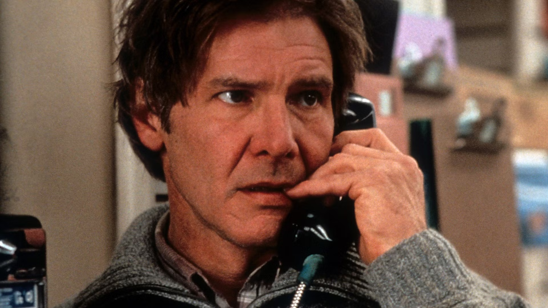
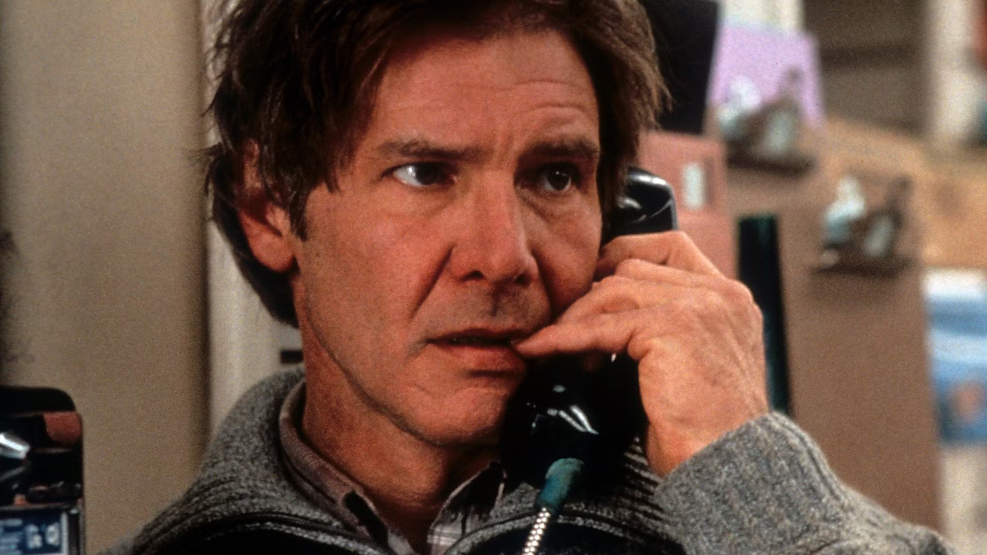
Decades after it captivated audiences worldwide, one of Harrison Ford‘s most renowned action movies has arrived on free streaming. Although he had previously played iconic characters such as Indiana Jones and Han Solo, Ford experienced a career boost in the early ’90s when he brought to life a man on the run for a crime he didn’t commit. Action fans: this is one of the classics you should put on your watchlist as soon as possible.
Whodunit Meets Non-Stop Action in ‘The Fugitive’
Based on the 1960s TV series of the same name, The Fugitive sees Ford play Dr. Richard Kimble, a surgeon whose wife is brutally murdered. Although he is clearly innocent, all the evidence points to him. Despite his claims of innocence, Kimble is charged with the murder and sentenced to death.
Kimble escapes during a prisoner transfer, and he goes on the run. Marshal Sam Gerard is tasked with capturing the fugitive, but Kimble’s only goal is to prove his innocence. As he digs deeper, Kimble uncovers a larger conspiracy that may have led to his wife’s murder, with Gerard also realizing that he may be after the wrong suspect.
/* Streaming Top 10 vignette. All rules are scoped under .st10.
One card with two faces (Movies, TV) that flips in 3D. Movies follows the
reader’s light/dark setting and TV is the opposite, so a flip always
changes the colour scheme. Neutrals are sampled from movieweb.com; the
open streamer’s brand colour (adapted for contrast) drives the frame,
active tab, highlight, change arrows and NEW badge. */
.st10 {
–st10-heading-font: ‘Poppins’, Arial, Helvetica, sans-serif;
–st10-body-font: ‘Roboto’, Arial, Helvetica, sans-serif;
/* Stat column widths */
–st10-w-change: 4.5rem;
–st10-w-days: 6.5rem;
–st10-w-rt: 3.75rem;
–st10-w-episodes: 5rem;
–st10-w-peak: 3.75rem;
–st10-w-runtime: 4.75rem;
–st10-w-weeks: 4.25rem;
/* Space between columns, carried by each cell’s left padding (a real
column gap would let scrolled cells show between the pinned columns) */
–st10-gap: 8px;
–st10-w-views: 4.75rem;
–st10-w-hours: 4.75rem;
box-sizing: border-box;
max-width: 760px;
margin: 24px auto;
font-family: var(–st10-body-font);
font-size: 15px;
line-height: 1.4;
container: st10 / inline-size;
}
.st10 *,
.st10 *::before,
.st10 *::after { box-sizing: inherit; }
/* CMS fields: never visible, whatever the host CSS does */
.st10 [data-st10-field] { display: none !important; }
.st10[hidden],
.st10 [hidden] { display: none !important; }
.st10 .st10__sr {
position: absolute !important;
width: 1px; height: 1px; margin: -1px; padding: 0;
overflow: hidden; clip: rect(0 0 0 0); white-space: nowrap; border: 0;
}
/* —- Static frame from the HTML block: shows until the script swaps in
the live chart (and in editors that don’t run scripts). Follows the
reader’s light/dark setting. —- */
.st10 .st10__shell {
–st10-panel: #ffffff; –st10-card: #f2f2f2; –st10-text: #181818; –st10-muted: #6b6b6b;
–st10-heading: #555555; –st10-rule: #e4e4e4; –st10-btn: #737373; –st10-btn-text: #ffffff;
–svc-ink: var(–svc-ink-l);
padding: 16px 16px 12px;
border: 1px solid var(–st10-rule);
border-color: color-mix(in srgb, var(–svc-fill) 55%, var(–st10-panel));
border-radius: 4px;
background: var(–st10-panel);
color: var(–st10-text);
}
@media (prefers-color-scheme: dark) {
.st10 .st10__shell {
–st10-panel: #181818; –st10-card: #333333; –st10-text: #ffffff; –st10-muted: #b0b0b0;
–st10-heading: #b0b0b0; –st10-rule: #2c2c2c; –svc-ink: var(–svc-ink-d);
}
}
/* A block can fix its theme with data-st10-theme=”light” or “dark” */
.st10[data-st10-theme=”dark”] .st10__shell {
–st10-panel: #181818; –st10-card: #333333; –st10-text: #ffffff; –st10-muted: #b0b0b0;
–st10-heading: #b0b0b0; –st10-rule: #2c2c2c; –svc-ink: var(–svc-ink-d);
}
.st10[data-st10-theme=”light”] .st10__shell {
–st10-panel: #ffffff; –st10-card: #f2f2f2; –st10-text: #181818; –st10-muted: #6b6b6b;
–st10-heading: #555555; –st10-rule: #e4e4e4; –svc-ink: var(–svc-ink-l);
}
.st10 .st10__shell .st10__flipbtn.is-on,
.st10 .st10__shell .st10__tab.is-on { background: var(–svc-fill); color: var(–svc-on); }
.st10 .st10__shell .st10__tab.is-on { box-shadow: 0 0 0 2px var(–st10-panel), 0 0 0 3px var(–svc-fill); }
.st10 .st10__shell .st10__flipbtn { cursor: default; }
.st10 .st10__skeleton { display: grid; }
/* Same height as the table’s column-header row, so nothing jumps when the chart arrives */
.st10 .st10__skeleton b { display: block; height: 27px; }
.st10 .st10__shell .st10__btn { cursor: default; }
.st10 .st10__skeleton i {
display: block;
height: 42px;
border-top: 1px solid var(–st10-rule);
background: linear-gradient(var(–st10-card), var(–st10-card)) 8px 50% / 55% 10px no-repeat;
opacity: 0.7;
}
/* Preview-only status line (why the widget couldn’t load) */
.st10 .st10__note {
margin: 8px 0 0;
padding: 12px 14px;
border: 1px dashed #737373;
border-radius: 4px;
background: #f2f2f2;
color: #181818;
font-size: 14px;
line-height: 1.4;
}
/* —- Themes (set per face) —- */
.st10 .st10__face.is-light {
–st10-panel: #ffffff;
–st10-card: #f2f2f2;
–st10-text: #181818;
–st10-muted: #6b6b6b;
–st10-heading: #555555;
–st10-rule: #e4e4e4;
–st10-btn: #737373;
–st10-btn-text: #ffffff;
–svc-ink: var(–svc-ink-l);
–st10-up: #0b5c2b;
–st10-down: #8f1218;
color-scheme: light;
}
.st10 .st10__face.is-dark {
–st10-panel: #181818;
–st10-card: #333333;
–st10-text: #ffffff;
–st10-muted: #b0b0b0;
–st10-heading: #b0b0b0;
–st10-rule: #2c2c2c;
–st10-btn: #737373;
–st10-btn-text: #ffffff;
–svc-ink: var(–svc-ink-d);
–st10-up: #4ade80;
–st10-down: #ffa3a3;
color-scheme: dark;
}
/* —- Streamer colours: fill, text on fill, ink for dark and light panels —- */
.st10 [data-svc] { –svc-fill: #de272e; –svc-on: #ffffff; –svc-ink-d: #ff5a5f; –svc-ink-l: #c81e25; }
.st10 [data-svc=”netflix”] { –svc-fill: #e50914; –svc-on: #ffffff; –svc-ink-d: #ff4a52; –svc-ink-l: #c20710; }
.st10 [data-svc=”prime”] { –svc-fill: #0f79d0; –svc-on: #ffffff; –svc-ink-d: #5cb6ff; –svc-ink-l: #0b6ab8; }
.st10 [data-svc=”max”] { –svc-fill: #5b2eff; –svc-on: #ffffff; –svc-ink-d: #a391ff; –svc-ink-l: #4a22e0; }
.st10 [data-svc=”disney”] { –svc-fill: #0e7c99; –svc-on: #ffffff; –svc-ink-d: #3fc1df; –svc-ink-l: #0b6f89; }
.st10 [data-svc=”paramount”] { –svc-fill: #0064ff; –svc-on: #ffffff; –svc-ink-d: #6ea3ff; –svc-ink-l: #0057dd; }
.st10 [data-svc=”hulu”] { –svc-fill: #1ce783; –svc-on: #05241a; –svc-ink-d: #1ce783; –svc-ink-l: #0a8a4b; }
.st10 [data-svc=”apple”] { –svc-ink-d: #e5e5ea; –svc-ink-l: #1d1d1f; }
.st10 .is-dark[data-svc=”apple”],
.st10 .is-dark [data-svc=”apple”] { –svc-fill: #f5f5f7; –svc-on: #111111; }
.st10 .is-light[data-svc=”apple”],
.st10 .is-light [data-svc=”apple”] { –svc-fill: #1d1d1f; –svc-on: #ffffff; }
/* —- The flipping card —- */
/* overflow-x: clip keeps a sideways-scrolling table inside a 3D card from
widening the page (Chrome lets it leak otherwise); vertical stays open */
.st10 .st10__card { perspective: 2000px; overflow-x: clip; }
.st10 .st10__spin {
position: relative;
transform-style: preserve-3d;
transition: transform 0.75s cubic-bezier(0.3, 0.7, 0.2, 1), height 0.35s ease;
}
.st10 .st10__spin.is-flipped { transform: rotateY(180deg); }
.st10 .st10__spin.no-anim { transition: none; }
.st10 .st10__face {
position: absolute;
top: 0;
left: 0;
right: 0;
padding: 16px 16px 12px;
border: 1px solid var(–st10-rule);
border-color: color-mix(in srgb, var(–svc-fill) 55%, var(–st10-panel));
border-radius: 4px;
background: var(–st10-panel);
color: var(–st10-text);
-webkit-backface-visibility: hidden;
backface-visibility: hidden;
transition: border-color 0.2s ease;
}
.st10 .st10__face + .st10__face { transform: rotateY(180deg); }
/* The side facing away, once the flip has finished: hidden outright, so no
browser can show any of it through the front */
.st10 .st10__face.is-away { visibility: hidden; }
@media (prefers-reduced-motion: reduce) {
.st10 .st10__spin { transition: none; }
}
.st10 button {
font: inherit;
color: inherit;
background: none;
border: 0;
margin: 0;
padding: 0;
cursor: pointer;
text-transform: none;
letter-spacing: normal;
}
/* Site link styles must not reach inside the widget (no double underlines) */
.st10 a,
.st10 a:hover,
.st10 a:visited {
border: 0 !important;
box-shadow: none !important;
background-image: none !important;
background-color: transparent !important;
}
.st10 a::before,
.st10 a::after { content: none !important; display: none !important; }
.st10 button:focus-visible,
.st10 a:focus-visible {
outline: 2px solid var(–svc-ink);
outline-offset: 2px;
}
/* —- Header: the site’s panel heading, with the Movies / TV switch —- */
.st10 .st10__head {
display: flex;
flex-wrap: wrap;
align-items: flex-start;
justify-content: space-between;
gap: 10px 16px;
margin: 0 0 12px;
}
.st10 .st10__titles { min-width: 0; }
.st10 .st10__title {
margin: 0;
padding: 0;
border: 0;
font-family: var(–st10-heading-font);
font-size: 20px;
font-weight: 600;
line-height: 1.2;
text-transform: uppercase;
color: var(–st10-heading);
}
.st10 .st10__date {
margin: 4px 0 0;
font-size: 13px;
color: var(–st10-muted);
}
.st10 .st10__flip {
display: inline-flex;
flex: none;
padding: 2px;
border-radius: 3px;
background: var(–st10-card);
}
.st10 .st10__flipbtn {
padding: 6px 12px;
border-radius: 2px;
color: var(–st10-muted);
font-family: var(–st10-heading-font);
font-size: 11px;
font-weight: 600;
line-height: 1.2;
text-transform: uppercase;
}
.st10 .st10__flipbtn:hover { color: var(–st10-text); }
.st10 .st10__flipbtn[aria-pressed=”true”] { background: var(–svc-fill); color: var(–svc-on); }
/* —- Service tabs: the site’s filter buttons, filled with the brand when open —- */
.st10 .st10__tabs {
display: flex;
flex-wrap: wrap;
gap: 6px;
margin: 0 0 12px;
}
.st10 .st10__tab,
.st10 .st10__btn {
display: inline-flex;
align-items: center;
gap: 5px;
padding: 6px 9px;
border-radius: 2px;
background: var(–st10-btn);
color: var(–st10-btn-text);
font-family: var(–st10-heading-font);
font-size: 11px;
font-weight: 600;
line-height: 1.2;
text-transform: uppercase;
white-space: nowrap;
}
.st10 .st10__tab:hover,
.st10 .st10__btn:hover { filter: brightness(1.12); }
.st10 .st10__btn–quiet {
background: transparent;
color: var(–st10-muted);
box-shadow: inset 0 0 0 1px var(–st10-rule);
}
.st10 .st10__btn–quiet:hover { color: var(–st10-text); filter: none; }
/* Tab layout by the widget’s width, for the static frame and the live card
alike: one row from 576px; below that even rows of equal buttons, at most
4 a row (the script sets –st10-tabcols from the tab count: 7 -> 4 + 3);
below 440px, where 4 no longer fit, one row that swipes sideways, never
uneven rows like 3 + 3 + 1. The 3px padding keeps the open tab’s ring
visible; the scrollbar is hidden (swipe, or arrow keys). */
@container st10 (max-width: 575.98px) {
.st10 .st10__tabs { display: grid; grid-template-columns: repeat(var(–st10-tabcols, 4), minmax(0, 1fr)); }
.st10 .st10__tabs .st10__tab { justify-content: center; }
}
@container st10 (max-width: 439.98px) {
.st10 .st10__tabs {
display: flex;
flex-wrap: nowrap;
overflow-x: auto;
padding: 3px;
margin-left: -3px;
margin-right: -3px;
scrollbar-width: none;
-webkit-overflow-scrolling: touch;
}
.st10 .st10__tabs::-webkit-scrollbar { display: none; }
.st10 .st10__tabs .st10__tab { flex: none; }
}
.st10 .st10__tab.is-on {
background: var(–svc-fill);
color: var(–svc-on);
box-shadow: 0 0 0 2px var(–st10-panel), 0 0 0 3px var(–svc-fill);
}
/* Two-row picker (Netflix). The top row is the main choice: solid fill when
selected, without the ring, so two rows don’t stack two heavy buttons.
The second row (language, or countries in the grouped layout) is quieter:
outlined buttons, the selected one in the accent’s outline and text. */
.st10 .st10__tabs–region { margin-bottom: 6px; }
.st10 .st10__tabs–region:last-child { margin-bottom: 12px; }
/* Prime has one row only: the loading frame keeps the same gap below it */
.st10[data-st10-variant=”prime”] .st10__shell .st10__tabs–region { margin-bottom: 12px; }
.st10 .st10__tabs–lang,
.st10 .st10__tabs–country { margin-bottom: 12px; }
.st10 .st10__tabs–region .st10__tab.is-on,
.st10 .st10__shell .st10__tabs–region .st10__tab.is-on { box-shadow: none; }
.st10 .st10__tabs–lang .st10__tab,
.st10 .st10__tabs–country .st10__tab,
.st10 .st10__shell .st10__tabs–lang .st10__tab {
background: transparent;
color: var(–st10-muted);
box-shadow: inset 0 0 0 1px var(–st10-rule);
}
.st10 .st10__tabs–lang .st10__tab:hover,
.st10 .st10__tabs–country .st10__tab:hover { color: var(–st10-text); filter: none; }
.st10 .st10__tabs–lang .st10__tab.is-on,
.st10 .st10__tabs–country .st10__tab.is-on,
.st10 .st10__shell .st10__tabs–lang .st10__tab.is-on {
background: var(–svc-fill);
color: var(–svc-on);
box-shadow: none;
font-weight: 700;
}
/* The picker rows fill the card’s width with equal buttons: one row when
wide (–st10-count is the number of buttons), even rows of at most 4 when
narrower (–st10-tabcols). Short labels, so they wrap rather than swipe. */
.st10 .st10__tabs.st10__tabs–region,
.st10 .st10__tabs.st10__tabs–lang,
.st10 .st10__tabs.st10__tabs–country {
display: grid;
grid-template-columns: repeat(var(–st10-count, 3), minmax(0, 1fr));
gap: 4px;
overflow: visible;
padding: 0;
margin-left: 0;
margin-right: 0;
}
.st10 .st10__tabs–region .st10__tab,
.st10 .st10__tabs–lang .st10__tab,
.st10 .st10__tabs–country .st10__tab { justify-content: center; flex: initial; }
@container st10 (max-width: 575.98px) {
.st10 .st10__tabs.st10__tabs–region,
.st10 .st10__tabs.st10__tabs–lang,
.st10 .st10__tabs.st10__tabs–country { grid-template-columns: repeat(var(–st10-tabcols, 3), minmax(0, 1fr)); }
}
@container st10 (max-width: 439.98px) {
.st10 .st10__tabs–region .st10__tab,
.st10 .st10__tabs–lang .st10__tab,
.st10 .st10__tabs–country .st10__tab { padding-left: 4px; padding-right: 4px; }
}
.st10 .st10__tab[disabled] { opacity: 0.4; cursor: default; }
.st10 .st10__tab[disabled]:hover { filter: none; }
/* Marks a tab the article’s title is on */
.st10 .st10__dot {
width: 6px;
height: 6px;
border-radius: 50%;
background: currentColor;
}
/* —- Table: one CSS grid per row; –st10-grid is set per table —- */
.st10 .st10__scroll { overflow-x: auto; }
.st10 .st10__scroll:focus-visible { outline: 2px solid var(–svc-ink); outline-offset: 2px; }
.st10 .st10__table { font-variant-numeric: tabular-nums; }
.st10 .st10__row {
–st10-rowbg: var(–st10-panel);
display: grid;
/* The title never gets narrower than 11rem; past that the stats scroll
sideways, with rank and title pinned */
grid-template-columns: calc(2rem + var(–st10-gap)) minmax(calc(11rem + var(–st10-gap)), 1fr) var(–st10-grid);
align-items: center;
column-gap: 0;
min-height: 42px;
padding: 0 8px 0 0;
border-top: 1px solid var(–st10-rule);
background: var(–st10-rowbg);
}
.st10 .st10__row–head {
align-items: end;
min-height: 0;
padding-bottom: 6px;
border-top: 0;
}
.st10 .st10__th,
.st10 .st10__td { min-width: 0; text-align: center; padding-left: var(–st10-gap); }
.st10 .st10__table { min-width: calc(2rem + 11rem + 2 * var(–st10-gap) + var(–st10-stats, 0rem) + 8px); }
/* Rank and title stay put while the stats scroll sideways */
.st10 .st10__td–rank,
.st10 .st10__th–rank,
.st10 .st10__td–title,
.st10 .st10__th–title {
position: sticky;
z-index: 1;
align-self: stretch;
display: flex;
align-items: center;
background: var(–st10-rowbg);
/* Safari (and every iPhone browser) draws pinned cells on their own layer
and ignores the face’s backface-visibility for them, so the far side’s
titles showed through mirrored. Each pinned cell hides its own back. */
-webkit-backface-visibility: hidden;
backface-visibility: hidden;
}
.st10 .st10__row–head .st10__th–rank,
.st10 .st10__row–head .st10__th–title { align-items: flex-end; }
.st10 .st10__td–rank,
.st10 .st10__th–rank { left: 0; justify-content: center; }
.st10 .st10__td–title,
.st10 .st10__th–title { left: calc(2rem + var(–st10-gap)); padding-right: 6px; }
.st10 .st10__scroll.is-scrolled .st10__td–title,
.st10 .st10__scroll.is-scrolled .st10__th–title { box-shadow: 6px 0 6px -6px rgba(0, 0, 0, 0.35); }
.st10 .st10__th–title,
.st10 .st10__td–title { text-align: left; }
.st10 .st10__sort {
display: inline-flex;
align-items: flex-end;
justify-content: center;
gap: 2px;
max-width: 100%;
padding: 2px;
color: var(–st10-muted);
font-family: var(–st10-heading-font);
font-size: 11px;
font-weight: 600;
line-height: 1.2;
text-transform: uppercase;
text-align: inherit;
}
.st10 .st10__th–title .st10__sort { justify-content: flex-start; }
.st10 .st10__sort:hover { color: var(–st10-text); }
.st10 .st10__sort.is-on { color: var(–svc-ink); }
.st10 .st10__arrow { flex: none; min-width: 0.6em; }
.st10 .st10__td–rank {
font-family: var(–st10-heading-font);
font-size: 16px;
font-weight: 700;
color: var(–st10-muted);
}
/* Title: always one line, so every row is the same height */
.st10 .st10__td–title {
display: flex;
align-items: center;
gap: 5px;
}
.st10 .st10__name {
min-width: 0;
overflow: hidden;
text-overflow: ellipsis;
white-space: nowrap;
font-weight: 500;
color: inherit;
text-decoration: none;
}
.st10 a.st10__name {
text-decoration: underline;
text-decoration-color: color-mix(in srgb, var(–svc-ink) 45%, transparent);
text-underline-offset: 3px;
}
.st10 a.st10__name:hover { color: var(–svc-ink); text-decoration-color: currentColor; }
.st10 .st10__year {
flex: none;
color: var(–st10-muted);
font-size: 13px;
}
/* A TV season label gives way to the show’s name: it shrinks first */
.st10 .st10__name { flex: 0 1 auto; }
.st10 .st10__season {
flex: 0 4 auto;
min-width: 0;
overflow: hidden;
text-overflow: ellipsis;
white-space: nowrap;
color: var(–st10-muted);
font-size: 13px;
}
.st10 .st10__na { color: var(–st10-muted); }
.st10 .st10__chg { font-weight: 700; font-size: 13px; white-space: nowrap; }
/* Movement is green up, red down in every streamer colour (checked for
contrast on both panels and the highlighted row) */
.st10 .st10__chg–up { color: var(–st10-up); }
.st10 .st10__chg–down { color: var(–st10-down); }
.st10 .st10__chg–same { color: var(–st10-muted); }
.st10 .st10__chg–new {
padding: 2px 5px;
border-radius: 2px;
background: var(–svc-fill);
color: var(–svc-on);
font-family: var(–st10-heading-font);
font-size: 10px;
font-weight: 600;
letter-spacing: 0.02em;
}
/* Rows with a hub page: the whole row opens it */
.st10 .st10__row.is-link { cursor: pointer; }
.st10 .st10__row.is-link:hover {
–st10-rowbg: color-mix(in srgb, var(–st10-text) 7%, var(–st10-panel));
}
.st10 .st10__row.is-link:hover .st10__name { color: var(–svc-ink); text-decoration-color: currentColor; }
/* The article’s title: a brand-tinted row */
.st10 .st10__row.is-subject {
–st10-rowbg: color-mix(in srgb, var(–svc-fill) 16%, var(–st10-panel));
border-radius: 2px;
}
.st10 .st10__row.is-subject.is-link:hover {
–st10-rowbg: color-mix(in srgb, var(–svc-fill) 26%, var(–st10-panel));
}
.st10 .st10__row.is-subject .st10__td–rank { color: var(–svc-ink); }
.st10 .st10__row.is-subject .st10__name { font-weight: 700; }
.st10 .st10__row.is-subject + .st10__row { border-top-color: transparent; }
/* —- Toggle and footer —- */
.st10 .st10__controls {
display: flex;
flex-wrap: wrap;
gap: 6px;
margin: 12px 0 0;
}
.st10 .st10__foot {
margin: 10px 0 0;
font-size: 11px;
color: var(–st10-muted);
}
/* —- Narrow: every column stays; the table scrolls sideways with the
rank and title pinned —- */
@container st10 (max-width: 600px) {
.st10 .st10__card,
.st10 .st10__shell {
–st10-w-change: 3.2rem;
–st10-w-days: 4rem;
–st10-w-rt: 3rem;
–st10-w-episodes: 4.2rem;
–st10-w-peak: 3rem;
–st10-w-runtime: 4.2rem;
–st10-w-weeks: 3.6rem;
–st10-gap: 0px;
–st10-w-views: 4rem;
–st10-w-hours: 4rem;
}
.st10 .st10__face { padding: 14px 12px 10px; }
.st10 .st10__shell { padding: 14px 12px 10px; }
.st10 .st10__skeleton b { height: 31px; }
/* Netflix’s narrow headers are all one line (Change, Weeks, Views) */
.st10[data-st10-variant=”netflix”] .st10__skeleton b,
.st10[data-st10-variant=”prime”] .st10__skeleton b { height: 20px; }
.st10 .st10__title { font-size: 17px; }
/* The title takes whatever width the stats leave, down to 8.5rem; only
below that does the table scroll sideways */
.st10 .st10__table { width: 100%; min-width: calc(1.6rem + 8.5rem + var(–st10-stats, 0rem) + 4px); font-size: 14px; }
.st10 .st10__season { font-size: 12px; }
.st10 .st10__year { font-size: 12px; }
/* No column gap here: scrolled cells would show through it between the
pinned columns. Cells pad themselves instead. */
.st10 .st10__row {
grid-template-columns: 1.6rem minmax(8.5rem, 1fr) var(–st10-grid);
padding: 0 4px 0 0;
}
.st10 .st10__th,
.st10 .st10__td { padding-left: 4px; }
.st10 .st10__td–rank,
.st10 .st10__th–rank { box-shadow: -4px 0 0 var(–st10-rowbg); }
.st10 .st10__td–title,
.st10 .st10__th–title { left: 1.6rem; padding-right: 4px; }
.st10 .st10__td–rank { font-size: 15px; }
.st10 .st10__sort { font-size: 10px; }
}
‘The Fugitive’ Was a Huge 1990s Hit
The Fugitive premiered in theaters in the summer of 1993. It grossed nearly $369 million against a $44 million budget, becoming one of the year’s highest-grossing films behind major hits like Mrs. Doubtfire and Jurassic Park.
The critical reception was also very positive, with some outlets considering it one of the best films of the year. Today, it boasts a solid 96% critics’ score and is Certified Fresh on Rotten Tomatoes. It is officially Harrison Ford’s highest-rated film on the review aggregator. Renowned Chicago critic Roger Ebert was among those who praised The Fugitive, and he wrote the following in his four-star review:
“The Fugitive is one of the best entertainments of the year, a tense, taut and expert thriller that becomes something more than that, an allegory about an innocent man in a world prepared to crush him…Thrillers are a much-debased genre these days, depending on special effects and formula for much of their content. The Fugitive has the standards of an earlier, more classic time, when acting, character and dialogue were meant to stand on their own, and where characters continued to change and develop right up until the last frame. Here is one of the year’s best films.”
The Fugitive earned seven Academy Award nominations, but only Tommy Lee Jones won for Best Supporting Actor. Jones also won Best Supporting Actor at the Golden Globes that year. The popularity of Gerard’s character was strong enough for The Fugitive to inspire a sequel and spin-off a few years later.
In 1998, U.S. Marshals was released in theaters, with Jones reprising his role as the law enforcement agent. However, the film focused on another fugitive, and Kimble was nowhere to be seen, which may have contributed to its mixed reception.
For those wanting to revisit The Fugitive more than 30 years after it became a box-office hit, the film is currently streaming for free. As part of its November lineup, the film was added to Pluto TV’s library, alongside other titles such as The Taking of Pelham 123, The Hurt Locker, and Crimson Tide.